cancel
Showing results for 
Show  only  | Search instead for 
Did you mean: 
elite343
New member
Status: New idea

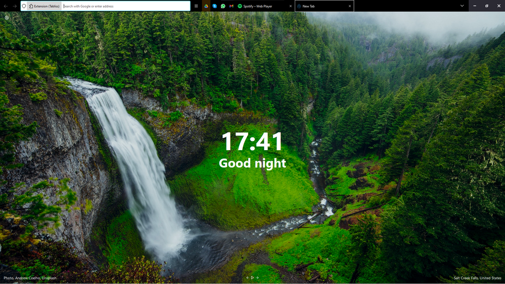
Hi!, I would like to share with you all a theme/tweak I was able to achieve using the legacy support of UserChrome.css [pals at Mozilla please, please never depreciate that feature] it works ok on desktop build 108.0.1, hopefully it gets implemented natively and if you are able to improve it please do!

Captura de pantalla 2022-12-19 174135.png
I'll not post tutorial links here to avoid breaking any forum rules BUT If you're interested on trying it look up
"Firefox UserChrome.css" 😀
(Literally just needs a toggle on the settings, create a folder and paste in there the attached file 😉)

Download Link

8 Comments
Status changed to: New idea
Jon
Community Manager
Community Manager

Thanks for submitting an idea to the Mozilla Connect community! Your idea is now open to votes (aka kudos) and comments.

Jon
Community Manager
Community Manager
未闻花名
New member

I have a proposal to make the interface of firefox more concise and beautiful

菜单栏对于我们来说可有可无 很多时候都选择隐藏 ,我还想更加的简洁 想把浏览器的url 地址栏 以及工具栏合并到标签栏 合并成一栏后看起来更加的酷炫

The menu bar is dispensable for us. Many times I choose to hide it. I also want to be more concise. I want to merge the browser’s url address bar and toolbar into the tab bar. It looks even cooler after being merged into one column.

Jon
Community Manager
Community Manager

(Note: a similar idea has been merged into this thread)

wally314garcia
Strollin' around

Every once in a while an idea comes up that makes you wonder why it isn't the standard. This is one of those ideas. I saw your reply on my thread and instantly fell in love, I just had to come over to personally thank you.

SimonB97
New member

Hi all, thanks for this, it's amazing, as other's mentioned already!

I just wanted to share a small fix (at least on my end):

**Problem**: The PanelUI Menu Button appears "in front of" the Extensions Button (right next to the URL-bar, to the right)

**Solution**: Add the lines marked with comments:

 #urlbar {
background:none !important;
border:none !important;
margin-left:0px !important;
font-size:12px !important;
max-width: 25vw !important; /* #0 (optional, if url-bar too short or too long, adjust this) */
}

/* ... */

#PanelUI-menu-button{
padding-top:0px !important;
margin-top: 0px !important;
margin-right: 30px !important;
position: relative !important; /* #1 */
z-index: 99 !important; /* #2 */
}

/* ... */

#unified-extensions-button{
padding-right: 40px !important;
position: relative !important; /* #3 */
z-index: 100 !important; /* #4 */
}
fridgetnostril8
New member

This is awesome, and exactly what I was looking for. I don't know anything about css, so if possible could you make the tabs use the new round design instead of the rectangles?

CASANOVA285
New member

Dear Firefox

I have just upgraded from version 90 to the current version 131.03. I have found out the the Tabs Title bar and search bars are too large for me. I have tried to customize it to no avail. I have been on V 90 for such a long time because any time I upgraded that same problem about the bars exist. I originally stayed on V 88 for a very long time before upgrading to V 90. Just as one of the users tell V 88 had been the best Interface for so far for Firefox. So, please advise me as to how shrink the bars to smaller widths.

Regards.

CASANOVA2850