Turn on suggestions
Auto-suggest helps you quickly narrow down your search results by suggesting possible matches as you type.
- Mozilla Connect
- Ideas
- New Right-Click Menu
Options
- Subscribe to RSS Feed
- Mark as New
- Mark as Read
- Bookmark
- Subscribe
- Printer Friendly Page
- Report Inappropriate Content
Eeeee
Making moves
Options
- Subscribe to RSS Feed
- Mark as New
- Mark as Read
- Bookmark
- Subscribe
- Printer Friendly Page
- Report Inappropriate Content
03-07-2024
01:28 AM
Status:
New idea
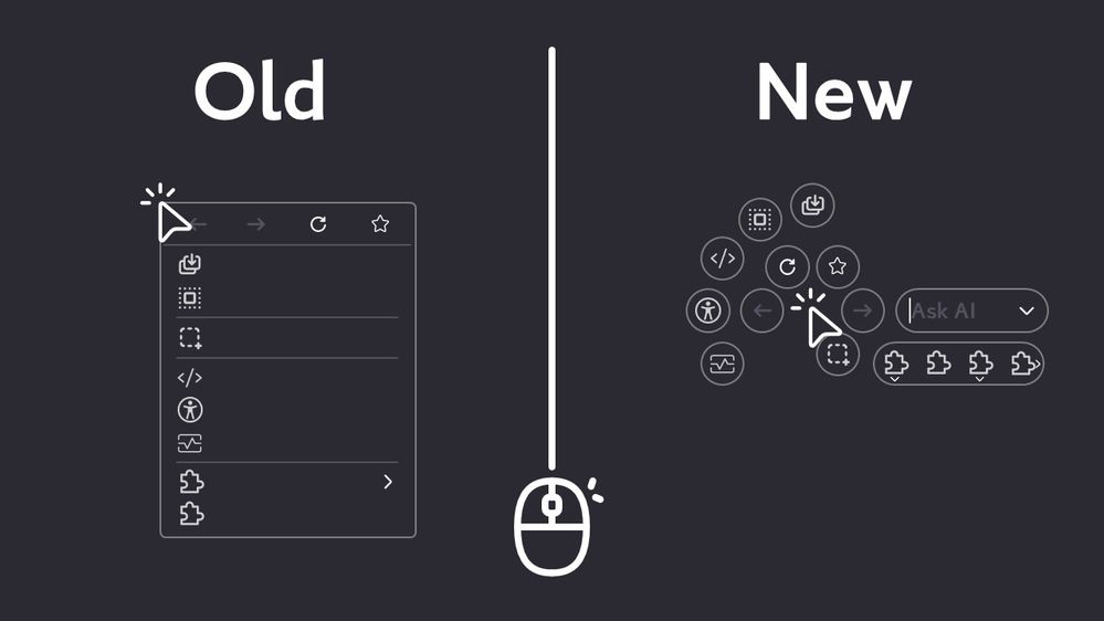
I came up with this strange new right-click menu interface a few days ago:
The advantages of this interface are as follows:
- customizable options.
- with the same number of options, the area blocking the content of the page is smaller (compared to the current right-click menu).
makes people lazier.Shorter paths for mouse movement.
The disadvantages are:
- it takes time to design a dedicated icon for each function.
- requires more complex interaction logic.
(I can't think of a logic or order for the options to automatically move away from the screen boundaries, so what I've drawn is just the expected layout of the options).
End of the introduction, next, I want to introduce the experience I thought of:
- If there are shortcuts available, they will be displayed more clearly (Firefox rookie friendly).
- enter text to talk to the AI directly after right-clicking (this is the idea of using the right mouse button as a shortcut to talk to the AI, after all, right-clicking and then entering text has no other function at the moment).
- Other functions to interact with AI are on the right side (I thought of it when I read this article: https://blog.nightly.mozilla.org/2024/06/24/experimenting-with-ai-services-in-nightly/ ).
- customizable options (maybe this interface can be integrated into the Customize Firefox page, but I don't know how at the moment)
I found that the options in the right-click menu would be different when I right-clicked on different things (it's not that hard to find out), so I think we should be able to customize the right-click menus for different things (i.e., the squares on the left-hand side block of the page). The white "●" in the center of the menu indicates the position of the cursor when the right-click button is pressed. The "●" can be dragged anywhere in the middle of the page to simulate the behavior of the menu when the right button is pressed in different places (I don't want to draw it, please imagine it yourself). In the future, if other Firefox functions are made into right-click menu options, they may be made into different shapes, so I've drawn two options on the right side of the page to show that the new right-click menu can be arranged in a strange way. As for the rounded square tray, it can be adjusted to a minimum size of 1×2, 2×1 (drag-and-drop ◞ adjustment), and a maximum of 32×32 should be enough, right? Also, the trays can be plural, so you can play with them like this:
(I don't use this feature)
- customizable style
After drawing, I found the finished product is quite ugly, so this function can be ignored for now.
END
By the way, I need the assets of Firefox UI to draw for my future ideas, where can I download them? The assets I used above are all found on the internet, except for the ones I drew myself.
See more ideas labeled with:
5 Comments
Idea Statuses
- New idea 8,513
- Trending idea 64
- Needs more 2
- In review 13
- Exploring more 12
- In development 57
- Not right now 8
- Delivered 207
- Closed 36
Top Kudoed Posts


