- Mozilla Connect
- Ideas
- New Compact Design
- Subscribe to RSS Feed
- Mark as New
- Mark as Read
- Bookmark
- Subscribe
- Printer Friendly Page
- Report Inappropriate Content
- Subscribe to RSS Feed
- Mark as New
- Mark as Read
- Bookmark
- Subscribe
- Printer Friendly Page
- Report Inappropriate Content
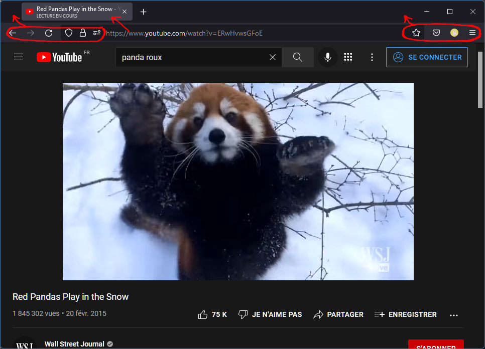
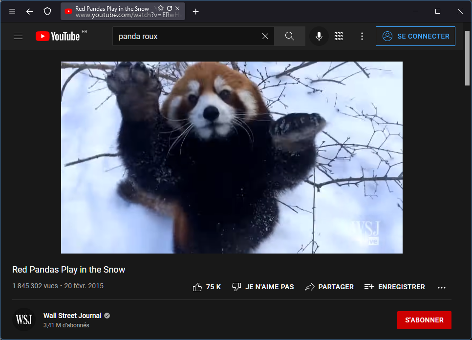
The latest controversial proton redesign added new two lines tabs, however it haven't been put to great use.
I think we can do better and at the same time bring back the compact mode by merging the search bar and the tab bar.
While we put the url directly into the tabs, other icons could go in the tool bar, making a better use of the window surface.
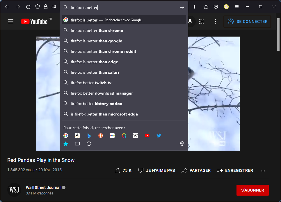
The url is a clickable text area
and expands to show the full search bar when we start typing.
----------------------------------------------------------------
UPDATE 1
To elaborate a bit more on my original idea
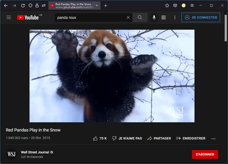
- We could put the hamburger button on the left because it looks a bit weird next to the reduce button (at least on windows)
- The same way the download icon is hidden unless we're downloading we could hide the back and forward buttons unless there's something in the history
- The refresh and fav button could be on the tab (and visible only on hover maybe ?)
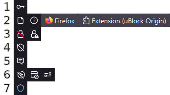
- The many icons that can appear on the left of the address bar could be fused all together in one single tabbed panel. The displayed icon would change based on priority :
(btw the Extension label could be removed and only show the extension name)
Which gives an even slicker look :
----------------------------------------------------------------
UPDATE 2
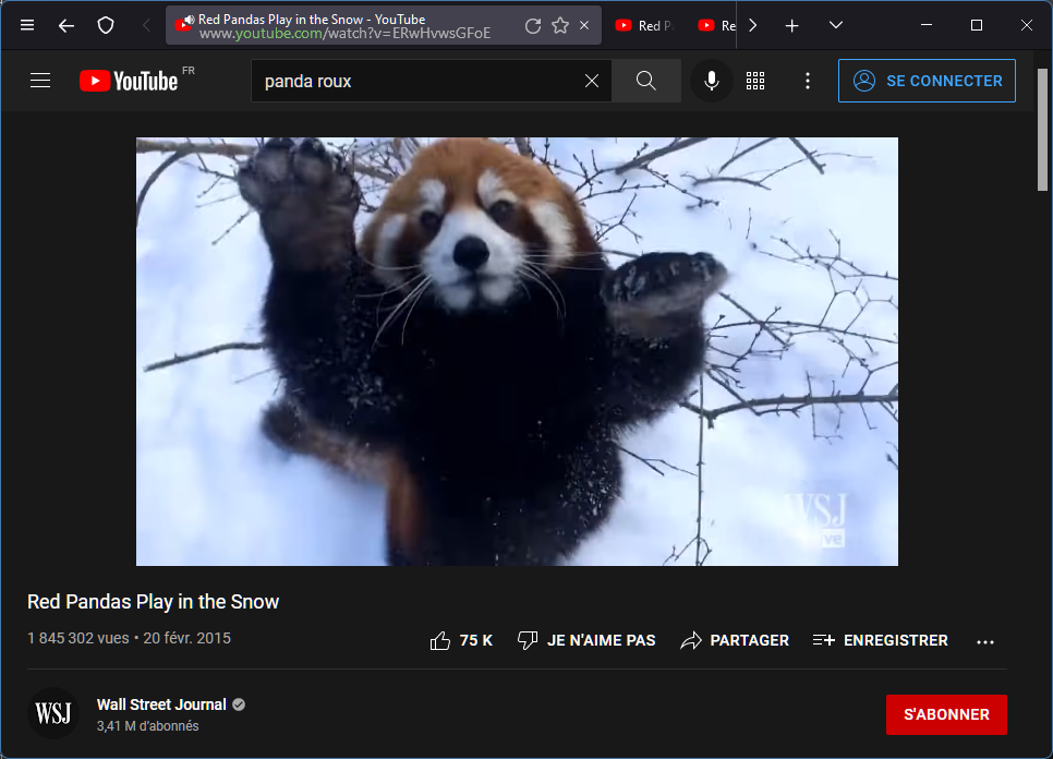
With larger active tab and refresh/fav icons.
With many tabs it could look like this :
I also added the sound indicator icon instead of the "Playing" text (this icon is already used on pinned tabs).
And since the Lock icon is not always visible with my unique icon idea I talked earlier I though we could color code the domain, green = secured, red = not secured. 🤔
- New idea 8,514
- Trending idea 64
- Needs more 2
- In review 13
- Exploring more 12
- In development 57
- Not right now 8
- Delivered 207
- Closed 36
