- Mozilla Connect
- Ideas
- Merge Protections, Site information, Permissions d...
- Subscribe to RSS Feed
- Mark as New
- Mark as Read
- Bookmark
- Subscribe
- Printer Friendly Page
- Report Inappropriate Content
- Subscribe to RSS Feed
- Mark as New
- Mark as Read
- Bookmark
- Subscribe
- Printer Friendly Page
- Report Inappropriate Content
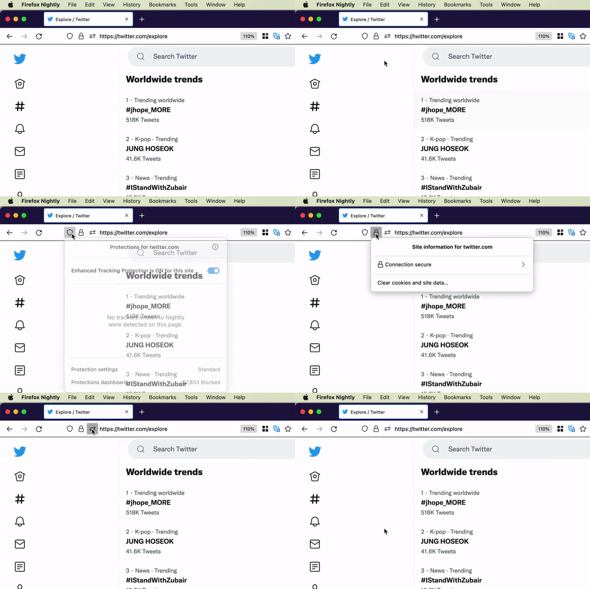
On desktop, there are three icons (if not more) on the left in the URL bar that open separate Protections, Site information, Permissions dialogs.
I think it would be better if all these dialogs were merged into a single Website dialog that contained all the information, settings, preferences, permissions, etc. for the current website. This would be less confusing for the user because everything would be in one place, and it would be easier to maintain and update for Mozilla for the same reason.
I would love to have site-specific preferences for color scheme, reduced motion, reduced data, and more. Right now, adding these preferences is a problem because Mozilla has to first figure out where to put them in Firefox’s UI, but if there was a Website dialog, all of this could be just added to it.
- New idea 8,514
- Trending idea 64
- Needs more 2
- In review 13
- Exploring more 12
- In development 57
- Not right now 8
- Delivered 207
- Closed 36

