cancel
Showing results for 
Show  only  | Search instead for 
Did you mean: 
lovelyjubbly
Making moves
Status: In review

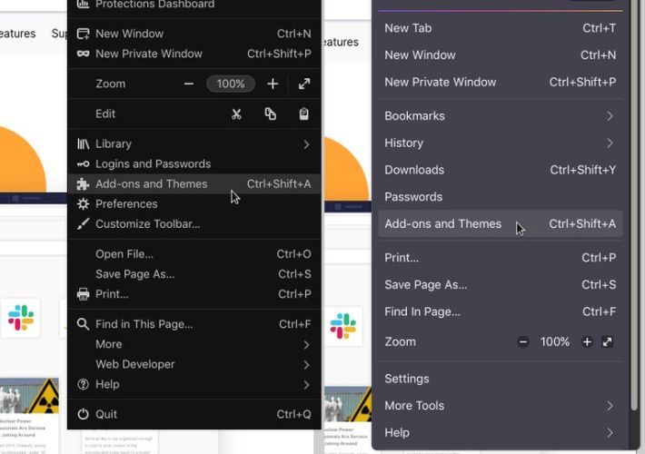
Firefox 88 had icons and labels on the main menu and the context menu.  After Firefox 88, it's just labels.

Menu icons give instant visual cues, help speed up the act of finding the needed menu item, plus they help non-tech savvy users.

Idea: Please bring back the menu icons. Or, at least, give us an option to see them.

xudixtwn7ru61_qcdtzu.jpg

Removing the icons has become a persistent speedbump in productivity usage despite months of trying to get accustomed to it. It would be great to have icons in the menus again. Thanks

60 Comments
FineWine
Strollin' around

@Progress2000  Does Lepton work with macOS Firefox 116 ??

A long long time ago I used Mostly Crystal by Cat Thief's own FF makeover

I currently use https://github.com/Aris-t2/CustomCSSforFx for most of my tweaking along with my own userChrome.css.

Progress2000
Making moves

@FineWineAccording to its Github page, it should support. I cannot confirm because I do not use Mac. I works on Windows. You should just try it.


Synchro
Familiar face

I support this idea. It's more convenient for me to have icons.

Readto
Strollin' around

These icons make the browser more convenient for the average user. They are important

Petri
New member

Really support this. Preferably, put some colours on the icons as well to make it easy to differentiate between them

georgestefanb
Strollin' around

I also want for Firefox to bring back the menu icons.

vtibi
New member

Bring them back.. Please.. I miss them so much ever since it was removed. I still have no idea how it was an improvement.

techfox
Making moves

The idea seems fine to me. But I don't dislike the current state either. If possible, it should be configurable and optional whether to have them or not.

If Firefox can run a bit faster without them and we can keep it icon-free, perfect. And if someone wants them because they prefer the visual aspect, they should be able to add them too.

iisrilin
Strollin' around

Sick of the minimalize every feature as much as possible trend, it's a tool that we have to use.

Iconography enhances usability, same with tab groups.
It's time to prioritize usability and UX again and add these features again.

ThePillenwerfer
Familiar face

Computer UI design seems to be going backwards.  When I first saw Windows 10 I thought it was how it would have looked in the 1930s if it had been around.  There's also the fad for 'Dark' themes, like DOS systems were forty years ago.

Yes, I'm in favour of Icons but if they do come back at least make them nice and not like the horrible, small, spindly back and white things Thunderbird comes with.

I'm all for functionality foremost but we spend a lot of time looking at computer screens so we might as well have something pleasant.

FrameXX
New member

Use icons for menu items (in main menu and context menus)

In the right click context menu there even is a space for icons, but it is only used for extensions. I don't know how much work it would be to add icons next to all items in context menus and the main menu, but I think it really would be worth the effort, look better and mainly improve the ability to discern one menu item from another especially for new users who don't already have a memory map of which option is where. Menus would no longer be just a column of text, but give more visual and symbolic clue as to what item means what.

Jon
Community Manager
Community Manager

(Note: similar ideas have been merged into this thread)

wensveen
Strollin' around

It would be nice if the icons could be part of a theme. Then if Mozilla wants to have no icons that could be the default theme and people that want icons could use a theme that has icons.

ThePillenwerfer
Familiar face

Definitely.  As it stands themes can do little beyond changing colours.

v-tibi
New member

Mobile version has it, why is this inconsistency across platforms? The first time it was taken away it was a pain to navigate. Reading through the items is so much slower, and it is an annoyance when you have to adjust something quickly. It also helps when you are in a situation where you happen to have to use some foreign language version. It should really have an option to turn it back on for all the unlucky folks who don't have photographic memory and have all the menus memorized.