cancel
Showing results for 
Show  only  | Search instead for 
Did you mean: 
KERR
Making moves
Status: New idea

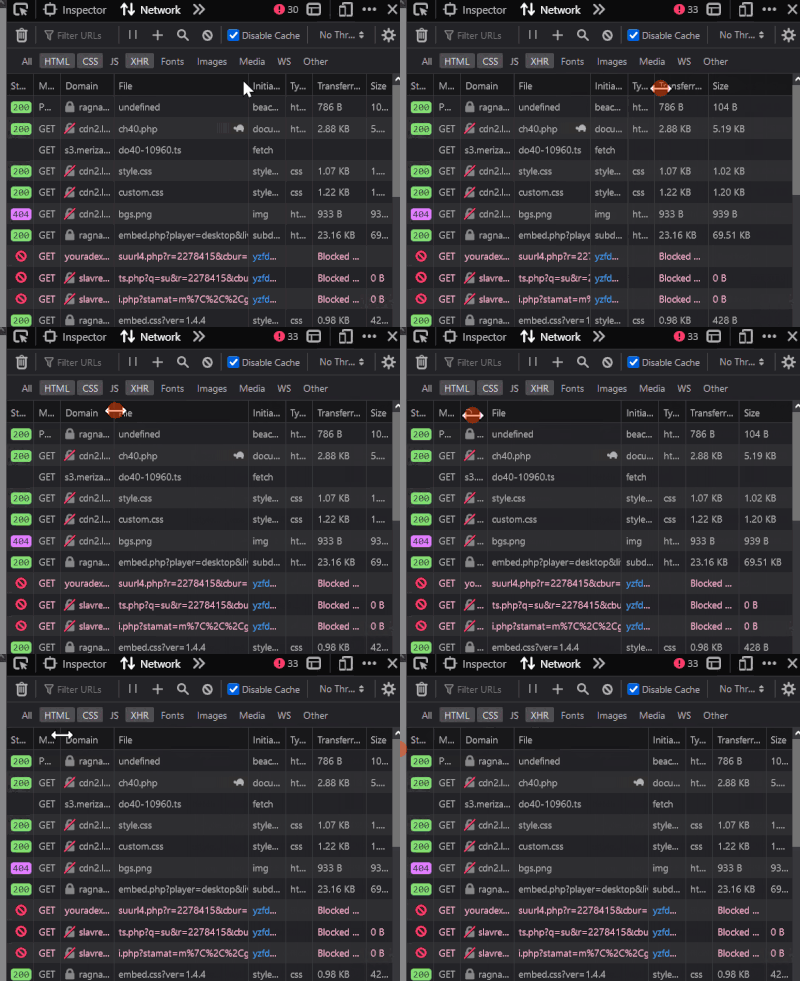
It's difficult to see info from some columns in the dev tools unless you make the dev tools pane a lot larger:

KERR_0-1660307383245.gif

Any chance this could be improved? Cheers!

9 Comments
Status changed to: New idea
Jon
Community Manager
Community Manager

Thanks for submitting an idea to the Mozilla Connect community! Your idea is now open to votes (aka kudos) and comments.

Masoudahmadig
Strollin' around

Your welcome,Good

Honza
Employee
Employee

Agreed, the resizing logic isn't ideal. Do you have specific suggestions to how it should behave?

KERR
Making moves

Hey @Honza !

Usually I like to see the full domain or file name - the other columns aren't as important to me for resizing. I know it will probably "squeeze" the other columns which isn't great.

Just realised I can double click the resize cursor to auto resize the column! This might keep me out of trouble!

KERR_0-1661164605953.png


Honza
Employee
Employee

Great, thank you for the update!

ww
Making moves

The problem also perplexed me,i hope its style can be done  as well as chrome,it's a very good solution

ww
Making moves

Why can't make it the same as windows defender?

序列 01.gif

gblx
New member

It's insane that this was ever a problem to begin with.

Honza
Employee
Employee

I filed https://bugzilla.mozilla.org/show_bug.cgi?id=1867723

I agree, the resizing logic is just confusing.