- Mozilla Connect
- Discussions
- Thunderbird icon is inappropriate for its job
- Subscribe to RSS Feed
- Mark Topic as New
- Mark Topic as Read
- Float this Topic for Current User
- Bookmark
- Subscribe
- Mute
- Printer Friendly Page
Thunderbird icon is inappropriate for its job
- Mark as New
- Bookmark
- Subscribe
- Mute
- Subscribe to RSS Feed
- Permalink
- Report Inappropriate Content
04-09-2023
10:43 PM
- last edited on
05-09-2023
12:16 PM
by
![]() Jon
Jon
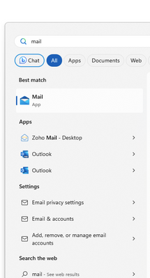
The icon is not good. I'm saying that as a long-time user of Mozilla products. Your Thunderbird icon doesn't fit the bill any more. Email apps have semi-standardized on using an image or cartoon of an envelope as the outline shape for the mail app. You guys need to do something to make your app less like a circular blob and more like a Mail-shaped app icon. Integrate the Thunderbird theme into the envelope shape in a novel way, but don't totally obscure the known shape. This is bad:
Also, include the word "mail" in the title of the app, and/or encode both "mail" and "email" as an alternative look-up term for Windows Start menu. If I type "mail" I should see "Thunderbird" or "Thunderbird mail" in the search results.
- Move Junk icon to another position in Thunderbird? The position beside "Delete" creates problems for me at times in Discussions
- 128.10.2esr is idiotic in Discussions
- Set of Improvements to Tray Icon in Discussions
- ThunderBird filter (Windows) - not removing notification in SysTray when moving in Discussions
- Thunderbird Nightly v. 136.0a1 (2025-01-24) - Alert sound not playing; icons not appearing in task bar in Discussions


