- Mozilla Connect
- Discussions
- Re: Firefox 151 Introduces a Fresh New Look for Ho...
- Subscribe to RSS Feed
- Mark Topic as New
- Mark Topic as Read
- Float this Topic for Current User
- Bookmark
- Subscribe
- Mute
- Printer Friendly Page
Firefox 151 Introduces a Fresh New Look for Home & New Tab (Desktop)


- Mark as New
- Bookmark
- Subscribe
- Mute
- Subscribe to RSS Feed
- Permalink
- Report Inappropriate Content
19-05-2026 07:27 AM
With Firefox 151, we’re updating the design across Firefox Home and New Tab experiences. This refresh introduces a cleaner, more modern look and feel to surfaces that millions of Firefox users see every day. The updated experience is designed to feel more polished, cohesive, and visually engaging while keeping Firefox fast and easy to use. It is also the foundation for future customization features, coming soon!
Some of the updates you may notice include
- Refined layouts and spacing
- Updated visual styling and treatments
- and New wallpapers - new styles of Kit themed wallpapers, and dark mode versions of previously-light only, as noted here

If you’ve updated to Firefox 151, you’ll begin seeing these changes as they roll out. Users of all versions in all channels will be able to use the new wallpapers immediately.
Let us know what you think below!
- Amber, Firefox Desktop Product
- Mark as New
- Bookmark
- Subscribe
- Mute
- Subscribe to RSS Feed
- Permalink
- Report Inappropriate Content
20-05-2026 05:42 AM
We will be introducing this very soon as an option in the Settings page!
- Mark as New
- Bookmark
- Subscribe
- Mute
- Subscribe to RSS Feed
- Permalink
- Report Inappropriate Content
20-05-2026 06:55 AM
Hello
Thanks for the feedback, because, a similar request https://connect.mozilla.org/t5/discussions/share-your-feedback-on-the-new-firefox-redesign/m-p/12580...
Below a test with userContent.css

- Mark as New
- Bookmark
- Subscribe
- Mute
- Subscribe to RSS Feed
- Permalink
- Report Inappropriate Content
20-05-2026 10:15 AM
In Firefox 151 the Firefox logo is over the top of my Aurora picture background. No option to remove it (config should not be necessary). I look forward to being able to have the clean background that I previously had in F150.
- Mark as New
- Bookmark
- Subscribe
- Mute
- Subscribe to RSS Feed
- Permalink
- Report Inappropriate Content
26-05-2026 05:42 AM
Thanks for flagging this. We’ve heard from several folks that the Firefox logo is showing in places where they expected a cleaner Home/New Tab setup. We have a fix and will be rolling out soon, in the next week or two!
Please hang in there and you may need to restart to see the fix.
Thanks again!
- Amber

- Mark as New
- Bookmark
- Subscribe
- Mute
- Subscribe to RSS Feed
- Permalink
- Report Inappropriate Content
20-05-2026 02:45 PM - edited 20-05-2026 02:49 PM
I agree. I have an Aurora background also.I want to remove the logo too. I already tried "browser.newtabpage.activity-stream.logowordmark.alwaysVisible" set to false. didn't help.
- Mark as New
- Bookmark
- Subscribe
- Mute
- Subscribe to RSS Feed
- Permalink
- Report Inappropriate Content
20-05-2026 11:53 PM
Hello
First, you can test
https://connect.mozilla.org/t5/discussions/latest-update-5-19-2026/m-p/125854/highlight/true#M49683
browser.newtabpage.activity-stream.nova.enabled false
Then
browser.newtabpage.activity-stream.logowordmark.alwaysVisible false
- Mark as New
- Bookmark
- Subscribe
- Mute
- Subscribe to RSS Feed
- Permalink
- Report Inappropriate Content
21-05-2026 01:15 AM - edited 21-05-2026 04:32 AM
Try, only, browser.newtabpage.activity-stream.nova.enabled
1 - Go to configuration editor https://support.mozilla.org/en-US/kb/about-config-editor-firefox
2 - Enter a search term browser.newtabpage.activity-stream.nova.enabled
You can double-click on the preference to set the value to false
Note: sorry, do not works, if, Shortcuts enabled, or, Recommended stories enabled.
- Mark as New
- Bookmark
- Subscribe
- Mute
- Subscribe to RSS Feed
- Permalink
- Report Inappropriate Content
21-05-2026 08:30 AM
browser.newtabpage.activity-stream.nova.enabled False.
This worked for me. Thank you.

- Mark as New
- Bookmark
- Subscribe
- Mute
- Subscribe to RSS Feed
- Permalink
- Report Inappropriate Content
24-05-2026 03:58 PM
It worked for me as well. And I have shortcuts enabled. Setting value to false returns weather widget to smaller size which allows firefox icon & shortcut icons to move up page about 1/2".
Wonder if we can move the weather widget to one of the bottom corners of the window.
- Mark as New
- Bookmark
- Subscribe
- Mute
- Subscribe to RSS Feed
- Permalink
- Report Inappropriate Content
26-05-2026 05:44 AM
We have a solution that will remove the logo for folks that have all New Tab / Firefox Home features off and will be rolling out soon, in the next week or two! Please hang in there and you may need to restart to see the fix.
In the 152 release, we will also have the ability for everyone to toggle it off in the Settings page, due to user request.
And please consider not changing anything in about:config - you won't see the update or future improvements and features, such as more widgets and widget controls.
Thanks again!

- Mark as New
- Bookmark
- Subscribe
- Mute
- Subscribe to RSS Feed
- Permalink
- Report Inappropriate Content
26-05-2026 08:41 AM
@AmberMeryman wroteAnd please consider not changing anything in about:config - you won't see the update or future improvements and features, such as more widgets and widget controls.
Tell you what: I'll reverse the change I made in about:config when you announce that you've fixed the issues and haven't added any new screw-ups in the process. As a former beta tester for several software companies, I find this latest obvious and totally avoidable fiasco inexcusable.

- Mark as New
- Bookmark
- Subscribe
- Mute
- Subscribe to RSS Feed
- Permalink
- Report Inappropriate Content
20-05-2026 05:19 AM
Actually, it's worse.
1. Misalignment vertically
2. Huge space on top.
3. Too small shortcuts
4. On zooming a page, not a single pixel/margine and all the shortcuts in ending row, are practically on the docke space (Macbook)
AI slop is eating everything, even some basic stuff like a simple html pages...
- Mark as New
- Bookmark
- Subscribe
- Mute
- Subscribe to RSS Feed
- Permalink
- Report Inappropriate Content
26-05-2026 05:46 AM
Are you finding that #2 is an issue only with 3+ rows of shortcuts, or with 1-2?
Thanks for your feedback!

- Mark as New
- Bookmark
- Subscribe
- Mute
- Subscribe to RSS Feed
- Permalink
- Report Inappropriate Content
20-05-2026 05:28 AM
Too much empty space at the top of the screen. What's this huge "container" for?
I use a zoom level of 140 percent so that the labels are larger and now they are all somewhere at the bottom of the screen.

- Mark as New
- Bookmark
- Subscribe
- Mute
- Subscribe to RSS Feed
- Permalink
- Report Inappropriate Content
20-05-2026 05:36 AM
I agree with other users. There are too many empty blocks. The empty space at the top prevents four rows of links from being displayed on a single screen.
- Mark as New
- Bookmark
- Subscribe
- Mute
- Subscribe to RSS Feed
- Permalink
- Report Inappropriate Content
26-05-2026 05:48 AM
Thanks for feedback! We hear you on the wasted space and the need to see shortcuts without unnecessary scrolling. This is something we are addressing this in an upcoming update - in the next week or two, so please hang in there a little longer.
Thanks!
- Amber

- Mark as New
- Bookmark
- Subscribe
- Mute
- Subscribe to RSS Feed
- Permalink
- Report Inappropriate Content
20-05-2026 07:40 AM - edited 20-05-2026 07:41 AM
When I opened Firefox today I was quite disapointed to see new look. The space above firefox logo and top bar is too big and the shortcut icons are too close together. I don't mind new changes but i liked the look before and it would be great if we were able to revert to previous layout or imho have much more customization settings in terms of placment of elements on the main page. I use Firefox for as long as I can remember and I wolud be very grateful if my input on this matter would be taken into consideration.
- Mark as New
- Bookmark
- Subscribe
- Mute
- Subscribe to RSS Feed
- Permalink
- Report Inappropriate Content
26-05-2026 05:48 AM
Thanks for feedback! We hear you on the wasted space and the need to see multiple rows of shortcuts without unnecessary scrolling. Do you have 2+ rows of Shortcuts?
This is something we are addressing this in an upcoming update - in the next week or two, so please hang in there a little longer.
Thanks!
- Amber

- Mark as New
- Bookmark
- Subscribe
- Mute
- Subscribe to RSS Feed
- Permalink
- Report Inappropriate Content
20-05-2026 07:43 AM
Updated to 151.0 and now I got this terrible New Tab page.
I have 16:9 1080p resolution in my desktop and I use zoom 170% in the new tab area where I see:
- 35% empty top space
- then a big firefox logo
- then 2 rows of icon shortcuts that now are smaller with their names cut off on two rows
- finally empty spaces in the left and right
What is happening ? every design UI change you do is in the negative from my perspective. Seriously how is this even possible, I keep coming here after major disappointments with this updates and I complain but clearly no one gives a...
Alright, mark my words this is how you will loose market share with small little upgrades that always go in the wrong way. Keep it up sooner then later people will migrate towards other options. This user here is very unhappy and just resigned.
- Mark as New
- Bookmark
- Subscribe
- Mute
- Subscribe to RSS Feed
- Permalink
- Report Inappropriate Content
26-05-2026 05:51 AM
The extra vertical space is making the page less useful, especially for people with multiple rows of shortcuts. We have a fix and expect to release in the next week or two.

- Mark as New
- Bookmark
- Subscribe
- Mute
- Subscribe to RSS Feed
- Permalink
- Report Inappropriate Content
20-05-2026 08:22 AM
I have a random letter "a" in the search engine selection box of the address bar. Why is it there and how can I remove it?
- Mark as New
- Bookmark
- Subscribe
- Mute
- Subscribe to RSS Feed
- Permalink
- Report Inappropriate Content
20-05-2026 10:43 AM
I resolved this by removing my userChrome.css font adjustment.

- Mark as New
- Bookmark
- Subscribe
- Mute
- Subscribe to RSS Feed
- Permalink
- Report Inappropriate Content
20-05-2026 09:40 AM
Please at least give us an option for larger icons on the New Tab page.
Additionally it would be really nice to actually have all 4 rows of shortcuts.
(Congratulations on getting me to sign up for an account just to complain about how you've made my life more annoying.)
- Mark as New
- Bookmark
- Subscribe
- Mute
- Subscribe to RSS Feed
- Permalink
- Report Inappropriate Content
26-05-2026 05:53 AM
Thank you for the feedback about larger icons - I will pass this along to my colleague!
We do have a fix for extra space with 3+ rows of Shortcuts arriving in the next week or two, so please hang in there a little longer.

- Mark as New
- Bookmark
- Subscribe
- Mute
- Subscribe to RSS Feed
- Permalink
- Report Inappropriate Content
20-05-2026 05:44 PM
Why did the update all of a sudden make my shortcuts move really far up the screen? I now have all of this empty space at the bottom and it just looks so odd!

- Mark as New
- Bookmark
- Subscribe
- Mute
- Subscribe to RSS Feed
- Permalink
- Report Inappropriate Content
26-05-2026 05:55 AM
Thank you for the feedback! Would you want the Shortcuts row to be all the way pulled up, even without 3+ rows?
One reason for the space is that we'll be making optional widgets available soon, but we still are looking at the layout for folks with a single row of Shortcuts - thanks!

- Mark as New
- Bookmark
- Subscribe
- Mute
- Subscribe to RSS Feed
- Permalink
- Report Inappropriate Content
20-05-2026 06:26 PM
- Excessive top padding: There is too much empty space above the search bar. This unnecessarily pushes the shortcuts block too far down the screen.
Shortcut spacing and centering: The shortcut icons are tightly packed together and overly centered. This leaves a massive amount of empty, unused space on the sides, making the central block look disconnected and awkward on a 2k monitor.
Overall, the layout feels un-proportional and lacks visual balance. It would be great to have an option to adjust the spacing or see a more harmonious distribution of elements.

- Mark as New
- Bookmark
- Subscribe
- Mute
- Subscribe to RSS Feed
- Permalink
- Report Inappropriate Content
20-05-2026 07:20 PM


i dont wanna see this firefox logo on my homepage, never had to see it before but latest update forces me to
- Mark as New
- Bookmark
- Subscribe
- Mute
- Subscribe to RSS Feed
- Permalink
- Report Inappropriate Content
21-05-2026 01:23 AM
- Mark as New
- Bookmark
- Subscribe
- Mute
- Subscribe to RSS Feed
- Permalink
- Report Inappropriate Content
26-05-2026 05:56 AM
Appreciate the feedback. The logo behavior wasn't intentional, for people who prefer a minimal or wallpaper-focused page. We have a fix in place now and will be releasing it in the next week or two!
- Mark as New
- Bookmark
- Subscribe
- Mute
- Subscribe to RSS Feed
- Permalink
- Report Inappropriate Content
27-05-2026 10:18 PM
Hello
This similar discussion thread
https://support.mozilla.org/en-US/questions/1583851
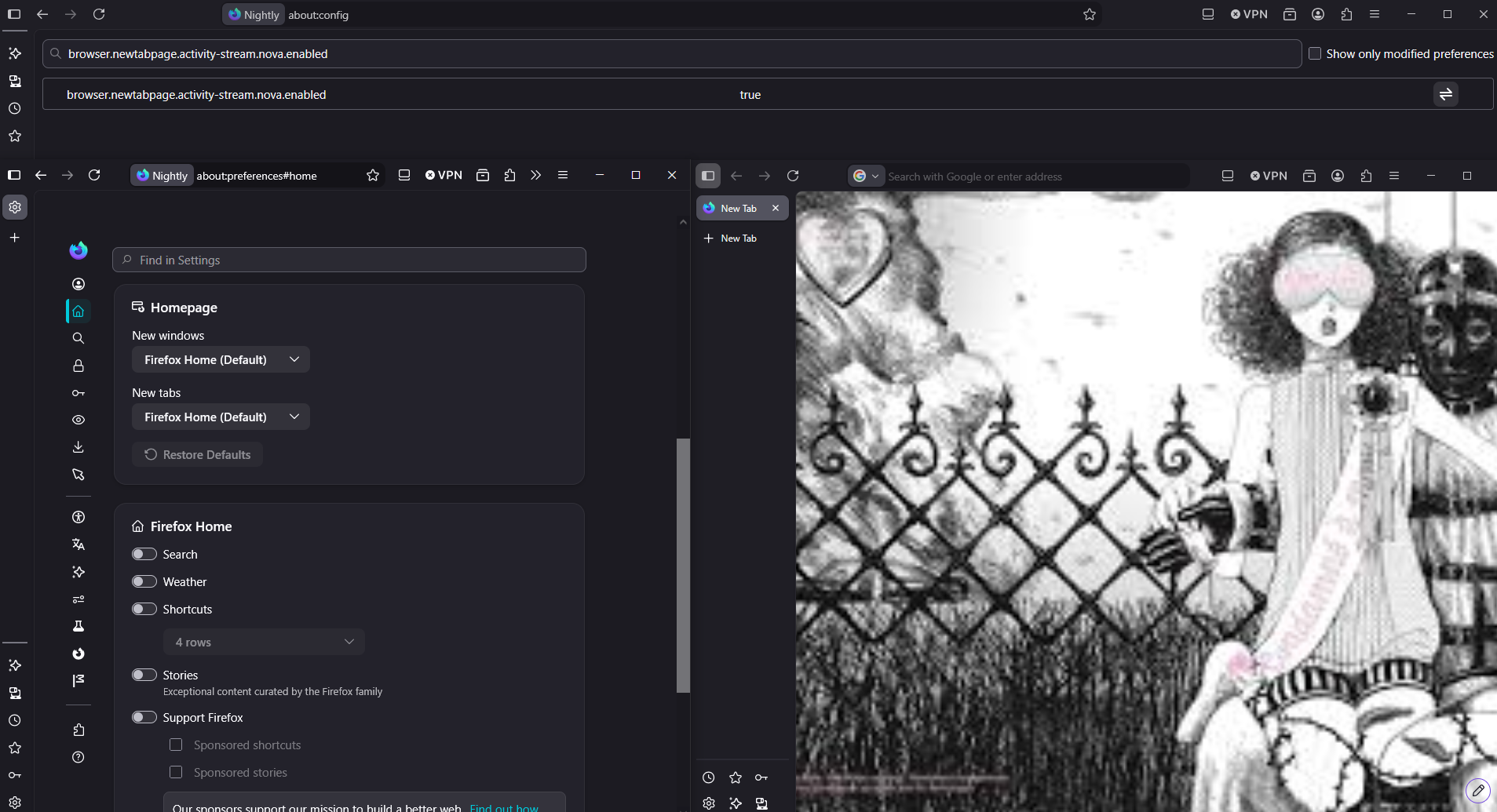
Currently, Firefox Nightly.
Preference, browser.newtabpage.activity-stream.nova.enabled, value true, by default.

- Mark as New
- Bookmark
- Subscribe
- Mute
- Subscribe to RSS Feed
- Permalink
- Report Inappropriate Content
20-05-2026 10:13 PM - edited 20-05-2026 10:39 PM
Hello
Similar requests
https://support.mozilla.org/en-US/questions/1582859
Below, a test with the help of userContent.css


- Mark as New
- Bookmark
- Subscribe
- Mute
- Subscribe to RSS Feed
- Permalink
- Report Inappropriate Content
20-05-2026 10:47 PM
I prefer the previous New Tab Page: there's more space between icon (shortcuts) and I use it as a speed dial.
I reverted to the previous version. I don't need al that stuff on the new tab page, just quick links (bookmarks) to the sites I visit the most.
- Mark as New
- Bookmark
- Subscribe
- Mute
- Subscribe to RSS Feed
- Permalink
- Report Inappropriate Content
21-05-2026 12:41 AM
I only have the shortcut links and the searchbar in my new tab page and now all the icons are all squished together and I HATE IT. It messes with my eyes. Please let it be more spaced out!

- Mark as New
- Bookmark
- Subscribe
- Mute
- Subscribe to RSS Feed
- Permalink
- Report Inappropriate Content
21-05-2026 04:32 AM
The OP's original supposition is fundamentally flawed. It assumes a number of things, but the most important is that the change to the home page was an improvement when it was not so. My actual experience with this change is that it has caused a degradation to the resolution of the layout in that it changed the size of the items, increased unnecessary and undesirable white space at the top of the page (and all around) thereby forcing a downward scroll so as to view everything, and thusly created a degradation in usability. Such is never an improvement and actually hampers the user experience. This was not well thought-out at all. What is more disturbing is that this concept is so easily proved to be not beneficial, that one can reasonable question the thought processes of those who involved themselves in implementing such changes and forced these upon the millions of users. Once again, we are faced with the need for intelligent management of programming teams.
- Mark as New
- Bookmark
- Subscribe
- Mute
- Subscribe to RSS Feed
- Permalink
- Report Inappropriate Content
21-05-2026 07:13 AM
So, this is going to sound a little silly. I always use Firefox at the smallest width it allows me to. This update makes it so that the home page cannot be as small in width as the minimum width of the Firefox window.
Now there is a scroll bar at the bottom and I can only see about 60% of the page.
I used to scroll through the recommendations on the page, but with the new update I'm not going to do that anymore.

- Mark as New
- Bookmark
- Subscribe
- Mute
- Subscribe to RSS Feed
- Permalink
- Report Inappropriate Content
21-05-2026 10:58 AM
The most useful feature of the new tab was demoted — it lost importance and prominence. The developers seem intent on forcing new features on users to show how clever and creative they are and to advance within the company. The process of opening a new tab and then using a shortcut to reach a webpage has been disrupted. Shortcut icons are now smaller, and you have to scroll to see the fourth row. A lot of space is wasted at the top of the new tab (above the Firefox icon and text), apparently reserved for an unnecessary weather widget. The sides are also empty while the icons are cramped into only half of the available area. It feels empty — like the good ideas in the developers’ minds. A few years ago they made a similar change, reducing shortcut icon size and stripping the new tab of attractive places to visit the web. Now they’ve done it again. What a terrible update surprise.
- Mark as New
- Bookmark
- Subscribe
- Mute
- Subscribe to RSS Feed
- Permalink
- Report Inappropriate Content
21-05-2026 11:07 AM
**bleep** straight! Well said.
I simply disabled the worthless (for me, anyway) weather icon because I get weather from the icon right below for WeatherUnderground that is a frequent web site. That is the whole purpose of those rows of icons; they are places we often go and are very convenient if the home page is laid out correctly. Like it used to be.
Just installed the FF update on my platform, but still has the stupid layout on the home page. Bummer.
- Mark as New
- Bookmark
- Subscribe
- Mute
- Subscribe to RSS Feed
- Permalink
- Report Inappropriate Content
21-05-2026 11:16 AM
Disabling or enabling the weather unwanted feature doesn't move the firefox icon and text above the shortcuts. That's why they leave the unused space and forced the 4th row of the shortcuts out of the screen. And my second shortcut is meteoblue. When I want proper weather information It's there I found. Only disappointment.
- Mark as New
- Bookmark
- Subscribe
- Mute
- Subscribe to RSS Feed
- Permalink
- Report Inappropriate Content
21-05-2026 02:39 PM
Totally understand. It is all bizarre.

- Bookmark search on iPad isn't competitive with Chrome in Discussions
- Needs more customisation in Discussions
- After using firefox for few weeks it does not connect to any site, have to restart computer in Discussions
- Advanced Privacy & Security Enhancements for Firefox (2026–2027) in Discussions
- Firefox icon theme changes are not applied consistently across all locations in Discussions
