- Mozilla Connect
- Ideas
- UX Improvement: Align "Close" button closer to tab...
- Subscribe to RSS Feed
- Mark as New
- Mark as Read
- Bookmark
- Subscribe
- Printer Friendly Page
- Report Inappropriate Content
- Subscribe to RSS Feed
- Mark as New
- Mark as Read
- Bookmark
- Subscribe
- Printer Friendly Page
- Report Inappropriate Content
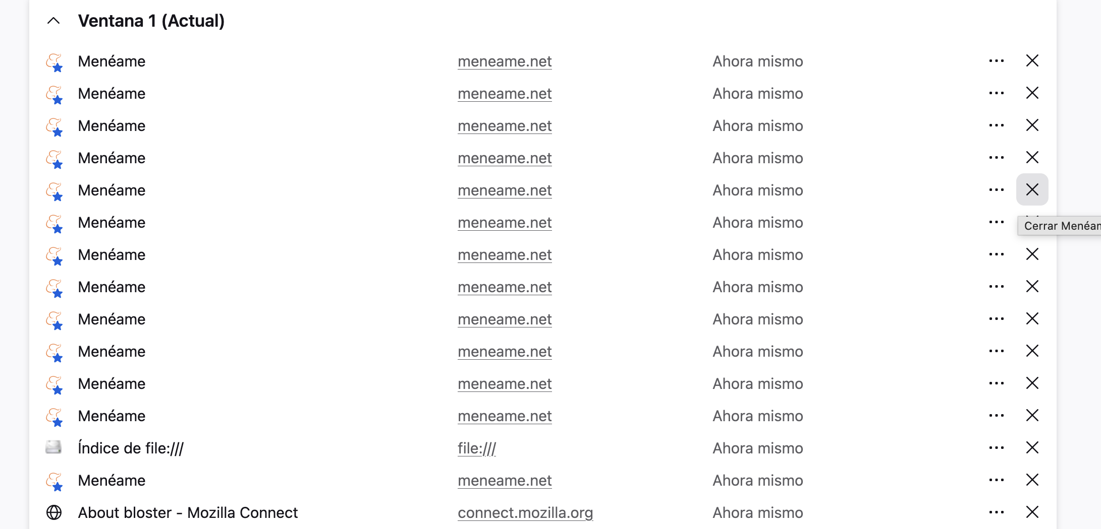
I am a frequent user of Firefox View and I find the feature extremely useful. However, I’ve noticed a significant usability issue regarding the list layout.
As shown in the attached file .png, the "Close" (X) button is aligned to the far right of the container, while the tab information is on the far left. When using wide screens or having many items, this large gap makes it difficult to visually track which "X" belongs to which tab. This often leads to accidental closures or a "guessing game" that slows down the workflow.
Suggested Solution:
-
Reduce the maximum width of the list items or move the action buttons (menu and close) closer to the tab metadata.
-
Implement a subtle hover highlight for the entire row to clarify the connection between the title and the close button.
I believe this small CSS/layout adjustment would greatly improve the accessibility and comfort of Firefox View.
- New idea 9,396
- Trending idea 60
- Needs more 2
- In review 12
- Exploring more 10
- In development 59
- Not right now 8
- Delivered 234
- Closed 44
