- Mozilla Connect
- Ideas
- The new tab button is way too far below, it needs ...
- Subscribe to RSS Feed
- Mark as New
- Mark as Read
- Bookmark
- Subscribe
- Printer Friendly Page
- Report Inappropriate Content
- Subscribe to RSS Feed
- Mark as New
- Mark as Read
- Bookmark
- Subscribe
- Printer Friendly Page
- Report Inappropriate Content
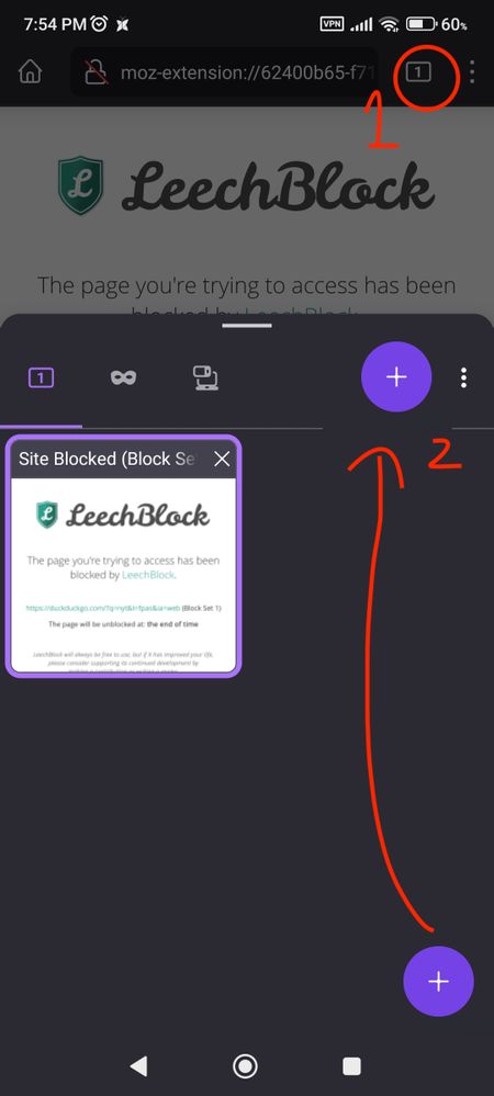
i assume this was done so it would be more natural for people who put the address bar at the bottom, but using the address bar at the bottom is weird because you still have to scroll all the way to the top of the webpage to get the address bar to appear (from the bottom).
so i left the address bar at the top, and when i reach up to tap the tabs button, the purple new tab button is all the way at the bottom, which makes my thumb travel a lot, from the top all the way to the bottom.
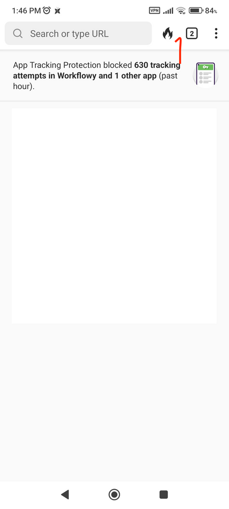
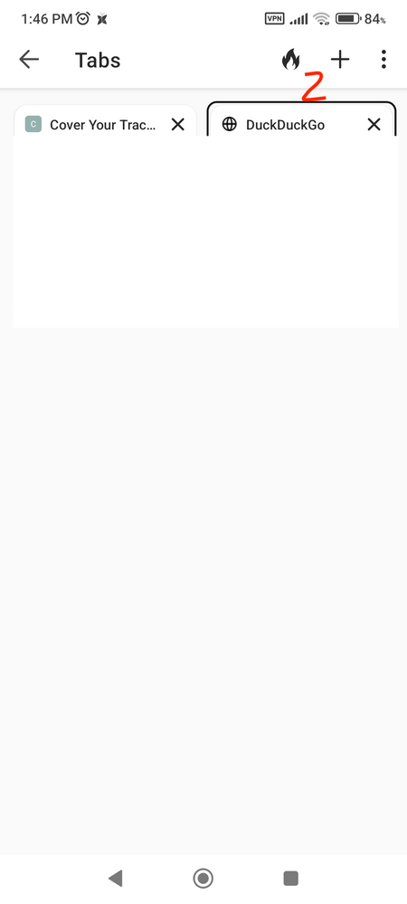
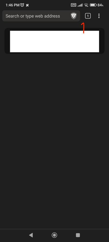
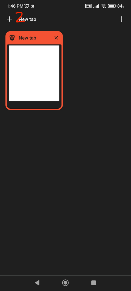
my suggestion is to move the purple button to near the right side of teh popup, near the middle. all other browsers, like brave and duckduckgo are similar, the show tabs and the new tab buttoms are close together! for my suggestion, the purple button is near the middle, is the natural place where the thumb moves after pressing the tab button, try it yourself!
let me know what you think of all this, this firefox browser is nearly perfect, it has good add-ons (like ublock origin!), it is just missing a good button position for the new tab button (which gets used a lot! which is why i am making this long post asking to change it)
- New idea 8,532
- Trending idea 64
- Needs more 2
- In review 13
- Exploring more 12
- In development 57
- Not right now 8
- Delivered 207
- Closed 36
