- Mozilla Connect
- Discussions
- Decorative update changes
- Subscribe to RSS Feed
- Mark Topic as New
- Mark Topic as Read
- Float this Topic for Current User
- Bookmark
- Subscribe
- Mute
- Printer Friendly Page
Decorative update changes
- Mark as New
- Bookmark
- Subscribe
- Mute
- Subscribe to RSS Feed
- Permalink
- Report Inappropriate Content
27-10-2022 07:30 PM
In the most recent update I was disappointed to see the color changes made. 1. The assumption that removing a choice for the white color of the browsing window was in my opinion not a good idea. I say choice because I already have dark reader which allowed me to use a dark field or light field as and when I wanted. I have no choice now. 2. The color green of the top icon site bar is not well thought out. Each person has a color preference and I am sure that there are people that like green and don't like green. It would be the same thing for any color scheme that was selected. So the real issue for a browser designer is functionality. How well does the color and or tonal contrast aid the viewer in seeing the printing clearly. In the new color update the color contrast has been lowered due to the tonal value of the green thereby affecting the contrast and clarity of the printing. I think decorative changes as opposed to functional changes should be considered thoroughly. There is less chance of causing unwanted results by sticking with functionality first and decoration better left with options so that a individual user can select what they would chose to see rather then assuming that the designer taste is what is appropriate for everyone. In short I believe you had the best functionality in my previous version.
- Mark as New
- Bookmark
- Subscribe
- Mute
- Subscribe to RSS Feed
- Permalink
- Report Inappropriate Content
28-10-2022 02:25 PM
Hi, if a new theme doesn't work well for you, you can switch to a different theme using the Add-ons page. See: https://support.mozilla.org/kb/use-themes-change-look-of-firefox
- Mark as New
- Bookmark
- Subscribe
- Mute
- Subscribe to RSS Feed
- Permalink
- Report Inappropriate Content
30-10-2022 10:19 AM
- Mark as New
- Bookmark
- Subscribe
- Mute
- Subscribe to RSS Feed
- Permalink
- Report Inappropriate Content
30-10-2022 03:21 PM
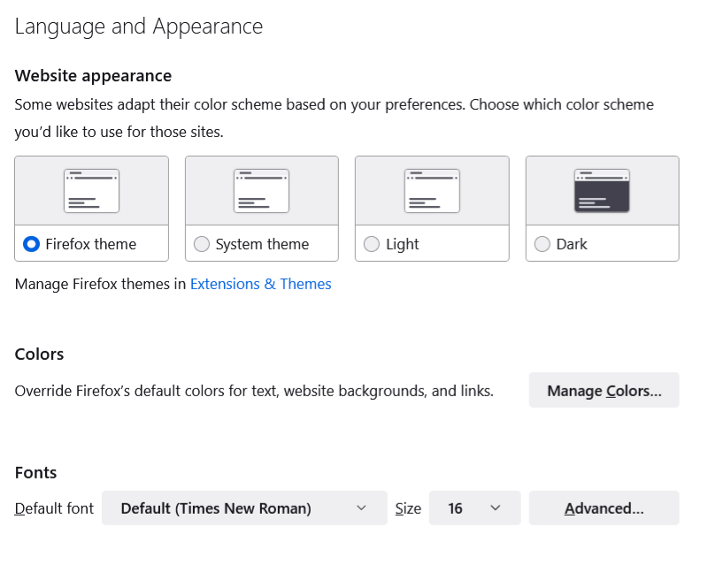
One of the built-in themes is named "Light" -- that should give you a light theme for sure. You also could review the "Website Appearance" section of the Settings page (on Mac, it might be called the Preferences page). This article shows the details: https://support.mozilla.org/kb/change-web-appearance-settings-firefox (below image is from the article).
- Make Firefox Backup more visible (more well-known) to users in Discussions
- Update moved my Inbox to a spot in alphatic order in Discussions
- thundebird, slow in rebuilding in Discussions
- Firefox stops loading webpages/playing videos after being open for around 4.5 hours in Discussions
- HTML Hyperlinks to outlook and password manager both don't work since update 150. in Discussions

