cancel
Showing results for 
Show  only  | Search instead for 
Did you mean: 
batata
Strollin' around
Status: New idea

What am I calling a modern context menu?

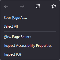
It's a context menu with a first line ribbon made of only icons, then followed by normal text entries. (Maybe there's another name for this idk)

You already have one in Firefox when right clicking an empty area :

00.png

My idea is to make this kind of context menu EVERYWHERE (when it makes sense), reasons :

  • More compact
  • Faster to use
  • Sexier

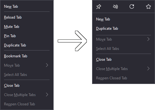
For example the context menu of a tab may look like this :

01.png

And there's many more menus that could be rethinked with this idea in mind, text selection, image, link...

8 Comments
Status changed to: New idea
Jon
Community Manager
Community Manager

Thanks for submitting an idea to the Mozilla Connect community! Your idea is now open to votes (aka kudos) and comments.

Anonymous
Not applicable

The inconsistent design of menus has been pointed out in other ideas. This problem has not been resolved for a long time.

Mk7
Strollin' around

This really needed FF should consider it ASAP.

dec
Strollin' around

Make the right click menu prettier

It is ugly and looks like it belongs to a 10 year old OS. Please change it to something modern like Edge or Safari

xUxSxExR
Making moves

This is a really good idea! This would make the menu less cluttered. Having an editing-feature would still give the possibility for changing it back, but this should not be a focus.


xUxSxExR
Making moves

@dec not very helpful comment, what is ugly about it? I find it looking very modern and want to state something important


DONT GO THE OFFICE WAY. Microsoft office and other apps are horrible, as their context menus change all the time, depending on what you click. This makes no sense often.


Simply remove elements, add icons, change things to wellknown icons, thats it.


gusamasan
Strollin' around

I would also suggest something like "more used options". Maybe, AI powered predictor.

For example, when I "right click" on videos (some sites) I get around of 17 options; currently, my "most used" option is at the 15 position.

Thank you, in advance.

brixter
Making moves

I don't really like it. Icons may look visually nicer but they are confusing. Words are clear what they mean.

The word "Paste" clearly means pasting something you've copied.

A Paintbrush icon isn't really clear what it does. Microsoft Office has a lot of icons for Paste and every time I need to hover over each icon to figure out what each Paintbrush icon means.