- Mozilla Connect
- Discussions
- Re: Wasted line in 125 Cards View
- Subscribe to RSS Feed
- Mark Topic as New
- Mark Topic as Read
- Float this Topic for Current User
- Bookmark
- Subscribe
- Mute
- Printer Friendly Page
Wasted line in 125 Cards View
- Mark as New
- Bookmark
- Subscribe
- Mute
- Subscribe to RSS Feed
- Permalink
- Report Inappropriate Content
25-04-2024 09:19 AM
- Mark as New
- Bookmark
- Subscribe
- Mute
- Subscribe to RSS Feed
- Permalink
- Report Inappropriate Content
26-04-2024 11:44 AM - edited 26-04-2024 12:17 PM


- Mark as New
- Bookmark
- Subscribe
- Mute
- Subscribe to RSS Feed
- Permalink
- Report Inappropriate Content
02-10-2024 01:32 AM
I totally agree! Have you found a way to revert to the previous setting? I hate those new "cards"!
- Mark as New
- Bookmark
- Subscribe
- Mute
- Subscribe to RSS Feed
- Permalink
- Report Inappropriate Content
12-08-2025 07:11 AM
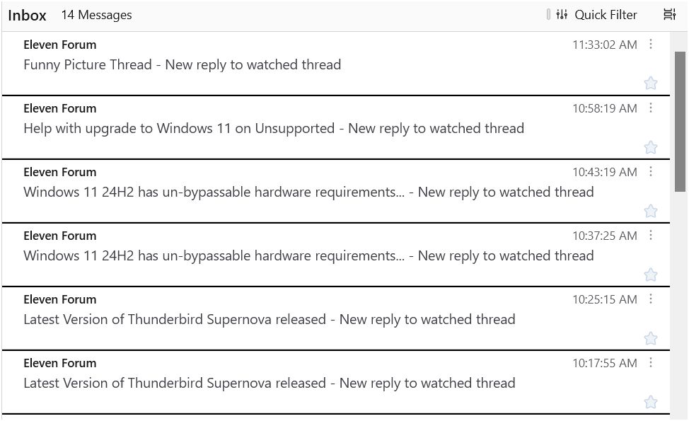
Love the cards, but hate that a start takes up an entire line of the 3 lines permitted. Either allow for 4 lines in cards view, allow text wrapping so that text can appear to the left of the star, or move the start up next to the date and time on the first line.
- Mark as New
- Bookmark
- Subscribe
- Mute
- Subscribe to RSS Feed
- Permalink
- Report Inappropriate Content
12-08-2025 07:31 AM
Hello
This clarification.
Take a look at
https://connect.mozilla.org/t5/discussions/thunderbird-128-redesigned-card-view-feedback/m-p/94910/h...
Thunderbird release notes
https://www.thunderbird.net/en-US/thunderbird/releases
Since the release of Thunderbird 139
New Implemented customizable row count for Cards View in 'Appearance' settings
- Mark as New
- Bookmark
- Subscribe
- Mute
- Subscribe to RSS Feed
- Permalink
- Report Inappropriate Content
12-08-2025 08:43 AM
Thanks for the response! Can you please help clarify...should I download the Beta release to get this feature? I'm not seeing customizable row count for Cards View in "Appearance" settings, I only see the option for 2 or 3 lines.
- Mark as New
- Bookmark
- Subscribe
- Mute
- Subscribe to RSS Feed
- Permalink
- Report Inappropriate Content
12-08-2025 08:47 AM
To clarify, I love the cards view, but really dislike that even with 3 lines selected, a "star" takes up an entire line of the 3 lines permitted. Would be much better if either: (a) allow for 4 lines in cards view, (b) allow text wrapping so that text can appear to the left of the star, and/or (c) move the "star" up next to the date and time on the first line, which would allow text from the email to use the third line.
- Mark as New
- Bookmark
- Subscribe
- Mute
- Subscribe to RSS Feed
- Permalink
- Report Inappropriate Content
12-08-2025 09:32 AM
Perhaps you could clarify your version of Thunderbird you are using.
https://www.thunderbird.net/en-US/thunderbird/139.0/releasenotes
https://www.thunderbird.net/en-US/thunderbird/140.0esr/releasenotes
By way of illustration
https://www.thunderbird.net/en-US/thunderbird/141.0/releasenotes


- Mark as New
- Bookmark
- Subscribe
- Mute
- Subscribe to RSS Feed
- Permalink
- Report Inappropriate Content
12-08-2025 10:56 AM
I'm using 141.0
- Thoughts on the new Android UI in Discussions
- Include email preview text in the card view in Discussions
- Why did my layout switch to Cards from table when I upgraded to Thunderbird 139.0? in Discussions
- Some suggestions for better usability of Firefox on tablets in Discussions
- Card Style For Email List Leaving Empty Wasted Space in Discussions
