- Mozilla Connect
- Discussions
- Re: Firefox View is now live in Fx106. Learn about...
- Subscribe to RSS Feed
- Mark Topic as New
- Mark Topic as Read
- Float this Topic for Current User
- Bookmark
- Subscribe
- Mute
- Printer Friendly Page
Firefox View is now live in Fx106. Learn about this new feature and tell us what you think!
- Mark as New
- Bookmark
- Subscribe
- Mute
- Subscribe to RSS Feed
- Permalink
- Report Inappropriate Content
18-10-2022 02:29 PM
Hello community!
Ray here, from the Firefox Desktop Product team excited to engage with you :). If you get a chance, we encourage you to check out Firefox View in the Fx106 release version. This brand new feature aims to help you get back to the content that you’ve previously discovered within the browser in a seamless manner. This optimized task continuity flow will surely bring a newfound confidence to anyone that may typically be hesitant to close tabs across devices for fear of losing important information!
Key functions include: being able to access recently closed tabs, tab pickup from other devices, and personal selection of Colorways. Put simply, it is a space where you can curate and shape your needs.
If you’re curious to read more about this feature please check out this article!
As we work to make this feature better for you, we’d like to welcome any and all feedback.
- Do you find Firefox View useful for information retrieval?
- Tell us about your favorite functionality in this feature!
- What additional integrations might you find helpful on this surface?
- Would it be useful to have a more expansive list of synced tabs from other devices?
- Does this surface encourage you to sync new devices to your Firefox Account?
Thank you in advance for your participation! We look forward to hearing from you.
- Mark as New
- Bookmark
- Subscribe
- Mute
- Subscribe to RSS Feed
- Permalink
- Report Inappropriate Content
18-10-2022 03:13 PM
I like the idea of having a dedicated hub for accessing closed and synced tabs, but I'm not sure why it's a new about:page when these features would've all been welcomed on Firefox Home (the New Tab Page)
- Mark as New
- Bookmark
- Subscribe
- Mute
- Subscribe to RSS Feed
- Permalink
- Report Inappropriate Content
22-10-2022 04:21 AM
i agree! it should be in the home page when scrolling down (after the shortcuts)
- Mark as New
- Bookmark
- Subscribe
- Mute
- Subscribe to RSS Feed
- Permalink
- Report Inappropriate Content
25-10-2022 05:32 PM
Agreed
- Mark as New
- Bookmark
- Subscribe
- Mute
- Subscribe to RSS Feed
- Permalink
- Report Inappropriate Content
01-11-2022 07:40 AM
Appreciate the feedback! @MintMain21 We're further digging into ways to integrate this experience into the New Tab surface. Stay tuned.
- Mark as New
- Bookmark
- Subscribe
- Mute
- Subscribe to RSS Feed
- Permalink
- Report Inappropriate Content
30-11-2022 04:46 AM - edited 30-11-2022 04:53 AM
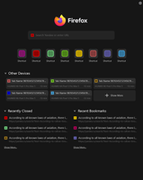
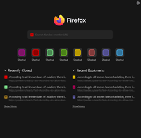
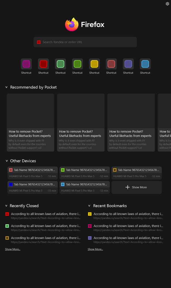
I tried playing around with UI and here's the concept I made:


Key changes:
- All the new widgets are located under current New Tab widgets. The new widgets include:
- "Other Devices" -- shows (2n-1) recently synced tabs from other devices, pressing the "Show More" button expands it to up to 3n more elements (where n is the amount of rows that can be fitted into the screen, e.g. for the concept art above it will be 3).
- "Recently Closed" -- shows 3 or 5 recently closed tabs, including their URL. Pressing the "Show More" button expands the lists to up to 10 elements.
- "Recent Bookmarks" -- shows 3 or 5 recently bookmarked tabs, including their URL. Pressing the "Show More" button expands the lists to up to 10 elements.
- Pocket Recommendations widget is now 1 or 2 columns high, and is scrolled to the right, to make it easier to access the new widgets. Maybe remove it completely, idk.
- Every widget now can be collapsed, just life in FF View (not sure about this feature, considering user can disable unneeded widgets in New Tab settings)
What do you think?
- Mark as New
- Bookmark
- Subscribe
- Mute
- Subscribe to RSS Feed
- Permalink
- Report Inappropriate Content
02-12-2022 12:11 PM
This is amazing @kremlinbot ! Thank you so much for taking time to propose and build such an amazing solution for the New Tab page. We will likely introduce an interplay between the 2 surfaces at minimum...but still need to do some analysis before we decide to condense into one singular experience.
- Mark as New
- Bookmark
- Subscribe
- Mute
- Subscribe to RSS Feed
- Permalink
- Report Inappropriate Content
02-12-2022 12:08 PM
Thanks for the feedback here! We're definitely thinking of ways to think about leveraging New Tab in the future for this surface. Maybe even providing a direct entrypoint into one another is a possibility.
- Mark as New
- Bookmark
- Subscribe
- Mute
- Subscribe to RSS Feed
- Permalink
- Report Inappropriate Content
18-10-2022 03:47 PM
Absolutely LOVE the new view page. Accessing tabs between devices is one of my most common tasks in Firefox and I often lamented that it wasn't easier, this makes my workflow so much smoother. Excited to see what else you bring to the page!
- Mark as New
- Bookmark
- Subscribe
- Mute
- Subscribe to RSS Feed
- Permalink
- Report Inappropriate Content
20-10-2022 10:04 AM
I'm curious why you don't use the Firefox Account menu on Desktop to access your devices? It's a simple drop-down that immediately shows available tabs on all your synced devices. When clicked a new tab is opened with that URL from the device. How is that harder than Firefox View?
- Mark as New
- Bookmark
- Subscribe
- Mute
- Subscribe to RSS Feed
- Permalink
- Report Inappropriate Content
05-11-2022 06:04 PM
@wathamTab hoarders have way way too many different devices and tabs open to make using the existing feature useable without a search option. Yes, the new awesome bar helps but using maximal screen real-estate can save the most time when looking for a particular group of tabs on a particular topic.
- Mark as New
- Bookmark
- Subscribe
- Mute
- Subscribe to RSS Feed
- Permalink
- Report Inappropriate Content
02-12-2022 12:16 PM
Thanks @rjt69 ! We're currently looking into incorporating expanding the View surface as well -- a sophisticated Search option is in the idea queue as we speak.
- Mark as New
- Bookmark
- Subscribe
- Mute
- Subscribe to RSS Feed
- Permalink
- Report Inappropriate Content
01-11-2022 07:43 AM
Thank you for the positive words @merger3 . So glad that you find this helpful to your workflow!
- Mark as New
- Bookmark
- Subscribe
- Mute
- Subscribe to RSS Feed
- Permalink
- Report Inappropriate Content
17-11-2022 04:03 PM
I also feel the same way. I was not expecting this feature with the recent update, but was so excited to see it that I told a bunch of people.
- Mark as New
- Bookmark
- Subscribe
- Mute
- Subscribe to RSS Feed
- Permalink
- Report Inappropriate Content
02-12-2022 12:17 PM
So glad that you're enjoying the feature!
- Mark as New
- Bookmark
- Subscribe
- Mute
- Subscribe to RSS Feed
- Permalink
- Report Inappropriate Content
18-10-2022 09:20 PM
I wanna remove this item
- Mark as New
- Bookmark
- Subscribe
- Mute
- Subscribe to RSS Feed
- Permalink
- Report Inappropriate Content
19-10-2022 07:45 AM
me too
- Mark as New
- Bookmark
- Subscribe
- Mute
- Subscribe to RSS Feed
- Permalink
- Report Inappropriate Content
19-10-2022 10:09 AM
Could you explain what makes you want to remove it? I'd like hear any feedback. Thank you.
- Mark as New
- Bookmark
- Subscribe
- Mute
- Subscribe to RSS Feed
- Permalink
- Report Inappropriate Content
19-10-2022 12:09 PM
While I can't speak for IO111, I'd like to not have it always shown as it is a waste of space if I don't have a ton of tabs open.
- Mark as New
- Bookmark
- Subscribe
- Mute
- Subscribe to RSS Feed
- Permalink
- Report Inappropriate Content
19-10-2022 03:52 PM
The question alone does not make any sense. What would anyone want to enter it in Firefox? It is distubing. If there is no help I'll grade back to 105.
- Mark as New
- Bookmark
- Subscribe
- Mute
- Subscribe to RSS Feed
- Permalink
- Report Inappropriate Content
20-10-2022 08:32 PM - edited 20-10-2022 08:33 PM
- Follow the first three steps in this tutorial to create a userChrome.css file: How to customize Firefox with CSS
- Paste this into your userChrome.css file:
#alltabs-button{display:none!important;}
- Restart Firefox
- Mark as New
- Bookmark
- Subscribe
- Mute
- Subscribe to RSS Feed
- Permalink
- Report Inappropriate Content
04-12-2022
04:57 AM
- last edited on
05-12-2022
06:11 AM
by
![]() Jon
Jon
The problem is, it'll remove the button for good, but the tab manager itself is useful if you have lots of tabs open and most of them don't fit on screen anymore. And that's how it used to be before FF106, when some desided to change it for no reason (probably "BEcaUsE ThiS is The WaY it WoRKs in cHroMe!!")
- Mark as New
- Bookmark
- Subscribe
- Mute
- Subscribe to RSS Feed
- Permalink
- Report Inappropriate Content
20-10-2022 11:33 PM
They probably want it to show up only when the tab bar is full. I, for one use multiple pinned tabs and to see which one is which, this list always useful for me, not only when tabs are overflowing.
- Mark as New
- Bookmark
- Subscribe
- Mute
- Subscribe to RSS Feed
- Permalink
- Report Inappropriate Content
21-10-2022 06:35 AM - edited 21-10-2022 06:37 AM
I think its really useful feature but placed way too far away from minimize button. It should be placed near it and icon changed into search one. I would keep Firefox View button near my profile button, or even better merge it with profile button altogether.
- Mark as New
- Bookmark
- Subscribe
- Mute
- Subscribe to RSS Feed
- Permalink
- Report Inappropriate Content
02-12-2022 12:18 PM
Thanks for this feedback @SnowMeow ! We can definitely explore other options for location and icon.
- Mark as New
- Bookmark
- Subscribe
- Mute
- Subscribe to RSS Feed
- Permalink
- Report Inappropriate Content
24-10-2022 02:26 PM
I think this is a nice feature and I installed addons that did the same in the past. I'm someone that has a lot of tabs open. with vertical tabs or not. but that thing has big flaws.
- is not automatic for when you don't have space. it should bide itself.
-You can't remove it. When devs are going to learn that every single thing they introduce requires to be able to be disabled. people hate forced changes.
- Mark as New
- Bookmark
- Subscribe
- Mute
- Subscribe to RSS Feed
- Permalink
- Report Inappropriate Content
21-11-2022 12:32 PM
Additional reason: I keep pressing it accidentally when I try to minimize the Firefox window. The 'down arrow' thing is too visually similar to the act of minimizing.
- Mark as New
- Bookmark
- Subscribe
- Mute
- Subscribe to RSS Feed
- Permalink
- Report Inappropriate Content
04-12-2022 04:54 AM - edited 04-12-2022 04:54 AM
Becuase it's useless waste of space and just mindless UI copy from Chrome. Before the update, the tab manager button was only shown when tabbar was overflown, which made much more sense (why would you ever search for a tabs, if the labels are still easily visible and all the tabs are on screen?)
So, I think it'd be the best to revert it back to the way it used to be before rather mindlessly copying bad designs from Chrome.
- Mark as New
- Bookmark
- Subscribe
- Mute
- Subscribe to RSS Feed
- Permalink
- Report Inappropriate Content
21-10-2022 12:26 AM
You can remove it in the "customize Toolbar" page.
- Mark as New
- Bookmark
- Subscribe
- Mute
- Subscribe to RSS Feed
- Permalink
- Report Inappropriate Content
21-10-2022 12:43 AM
No, you can't. If you try dragging it out of the toolbar it shows the disabled action mouse icon and won't let you remove it.
- Mark as New
- Bookmark
- Subscribe
- Mute
- Subscribe to RSS Feed
- Permalink
- Report Inappropriate Content
21-10-2022 02:21 AM
Sorry, I did not actually try it myself. I understand now.
- Mark as New
- Bookmark
- Subscribe
- Mute
- Subscribe to RSS Feed
- Permalink
- Report Inappropriate Content
21-10-2022 01:11 AM
enable userChrome.css and use this:
#tabbrowser-tabs ~ #alltabs-button {display:none!important;}
- Mark as New
- Bookmark
- Subscribe
- Mute
- Subscribe to RSS Feed
- Permalink
- Report Inappropriate Content
25-10-2022 09:06 AM
This really doesn't have to exist, they could of just used tree style tabs plugin as an inspiration and done that as an option instead.
Desktop screens are wide enough nowadays for tree style tabs and it makes more sense than a little dropdown button or horizontal tabs (who on earth has less than 10 tabs at any given time?).
- Mark as New
- Bookmark
- Subscribe
- Mute
- Subscribe to RSS Feed
- Permalink
- Report Inappropriate Content
01-11-2022 07:45 AM
There is a solution here to address this issue if you are still looking to remove the "list all tabs" button:
- Mark as New
- Bookmark
- Subscribe
- Mute
- Subscribe to RSS Feed
- Permalink
- Report Inappropriate Content
19-10-2022 12:40 AM
Do not push new features on users, give option to use it if user wants. Do not change browser on every new version. Give back option to get back anonymouv view like it was in the previous version - why new font, new color? Did not want that.
Browser supposed to be stable, simple, safe, not this whatever you are confusing browser with!
Please! I cannot be that hard.. just to keep it simple, safe, fuctioning browser like it has been for decades. There are other browser you know and this constant changes are frustrating.
- Mark as New
- Bookmark
- Subscribe
- Mute
- Subscribe to RSS Feed
- Permalink
- Report Inappropriate Content
25-10-2022 09:08 AM
I hate this latest update that I never even agreed to install... Surprise surprise after rebooting I got a new Firefox I never asked for that broke some of my plugins expected behaviors.
- Mark as New
- Bookmark
- Subscribe
- Mute
- Subscribe to RSS Feed
- Permalink
- Report Inappropriate Content
19-10-2022 06:48 AM
We’re excited to connect with you all about Firefox View and work together to make the feature even better!
A quick reminder…
When participating in this discussion, please remember to:
-Follow the Community Guidelines
Anything that violates the guidelines will be flagged and removed.
-Stay on topic
Let’s keep this thread focused and productive. If you have additional product feedback or ideas unrelated to the discussion topic, create a new post.
Thanks so much and looking forward to hearing your feedback 🙌
-The Community Team
- Mark as New
- Bookmark
- Subscribe
- Mute
- Subscribe to RSS Feed
- Permalink
- Report Inappropriate Content
19-10-2022 08:48 AM
I'm not sure I'll be using most of these "amazing features." I do know that the new toolbar color of pink/reddish can best be described as disgusting, and I can't figure out how to change it.
- Mark as New
- Bookmark
- Subscribe
- Mute
- Subscribe to RSS Feed
- Permalink
- Report Inappropriate Content
19-10-2022 01:09 PM - edited 19-10-2022 01:10 PM
Thank you all for your quick feedback! We'll do our best to address questions specifically, but I do want to offer directions on how to remove FxView from your tabstrip should you be looking to do so:
- Right-click on the FxView icon
- Select "Remove from Toolbar" (you can also choose to "Pin to Overflow Menu")
- This will relocate the icon into the "Customize Firefox" page (this page can be accessed by opening the application menu > selecting "More tools" > and selecting "Customize Toolbar")
- Once on the "Customize Firefox" page, you will see the FxView icon in the grid UI (or in the Overflow Menu if you placed it there instead)
- You have the ability to drag this icon anywhere within this page, or even back up to the Toolbar or the Tabstrip
For more information on this see our support page!
- Mark as New
- Bookmark
- Subscribe
- Mute
- Subscribe to RSS Feed
- Permalink
- Report Inappropriate Content
19-10-2022 04:00 PM


