- Mozilla Connect
- Discussions
- Firefox 124.0 new tab icon spacing changed and bad
- Subscribe to RSS Feed
- Mark Topic as New
- Mark Topic as Read
- Float this Topic for Current User
- Bookmark
- Subscribe
- Mute
- Printer Friendly Page
Firefox 124.0 new tab icon spacing changed and bad
- Mark as New
- Bookmark
- Subscribe
- Mute
- Subscribe to RSS Feed
- Permalink
- Report Inappropriate Content
23-03-2024 12:34 PM
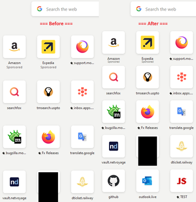
I use new tab with icons on firefox. It is just one of those features I love so much and keeps me using it. It is setup as 8 by 5 icons. Now in v124.0, something got changed in a horrible way. The spacing changed such that in order to see all the icon, I must zoom to 80% of the size to see them all. To make it worse, the text under the icons is small and hard for my eyes to read.
Who makes these changes? This needs to be reverted or fixed.
- Mark as New
- Bookmark
- Subscribe
- Mute
- Subscribe to RSS Feed
- Permalink
- Report Inappropriate Content
23-03-2024 02:55 PM
There is no built-in way to restyle the new tab page. But you can set Firefox to look for a user-specified style sheet at startup called userContent.css -- it's the lesser known cousin of userChrome.css. Here's an example of a userContent.css rule to tighten up the vertical spacing of the shortcuts on the new tab page in Firefox 124:
@-moz-document url(about:newtab), url(about:home) {
  /* Reduce spacing between rows of shortcuts on the new tab page */
  li.top-site-outer {
	margin-block-end: 0px !important;
  }
  a.top-site-button {
	padding-top: 5px !important;
  }
  span.sponsored-label {
	font-size: 0.75em !important;
	margin-top: -3px !important;
  }
}
userChrome.css and userContent.css are not officially supported, but you can find help and resources on Reddit at https://www.reddit.com/r/FirefoxCSS/.
I also have general background and setup steps on my website at https://www.userchrome.org/.
- Firefox disk IO can be expensive on Windows. in Discussions
- Cookie settings are confusing and inconsistent in Discussions
- Falling into an entrap. in Discussions
- Private Windows no longer being separated under the Private Icon in my taskbar in Discussions
- Good bye, thank you and good luck in Discussions

