- Mozilla Connect
- Discussions
- Feedback on the new UI: corner rounding, dark them...
- Subscribe to RSS Feed
- Mark Topic as New
- Mark Topic as Read
- Float this Topic for Current User
- Bookmark
- Subscribe
- Mute
- Printer Friendly Page
Feedback on the new UI: corner rounding, dark theme, and window density

- Mark as New
- Bookmark
- Subscribe
- Mute
- Subscribe to RSS Feed
- Permalink
- Report Inappropriate Content
14-09-2026 10:26 PM
Please reduce the corner radius of tabs and other UI elements. This is one of the things I really hate about Chrome. Alternatively, at least consider adding an option in the Appearance tab in the future to adjust the corner radius. I think this would suit most users.
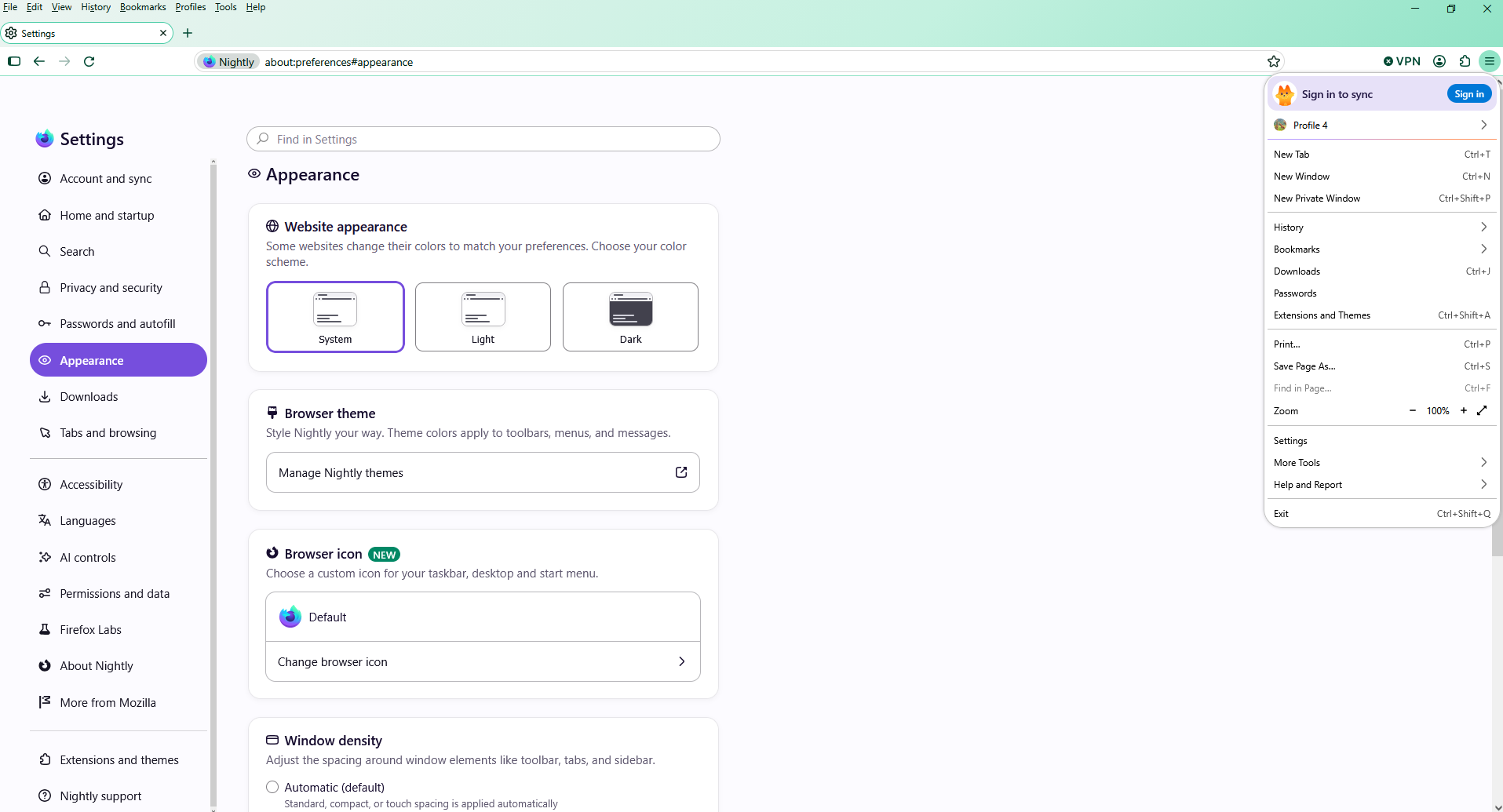
Also, the rounded menus have some issues because the entire interface hasn’t been fully updated to accommodate them. Some parts look incorrect, as shown in the screenshot.
I also don’t really like the new default dark theme. The top bar, at least on macOS, stands out too much. I think it would be better to keep it as a solid color like it was before.
That said, thanks for the “Window density” feature! I used to do this through CSS in my theme, and now there’s finally a proper built-in option for it.

- Mark as New
- Bookmark
- Subscribe
- Mute
- Subscribe to RSS Feed
- Permalink
- Report Inappropriate Content
14-09-2026 10:57 PM
Bonjour
For illustration userChrome.css
https://www.youtube.com/watch?v=OJF6i0OsEXA
https://connect.mozilla.org/t5/firefox-labs/can-you-stop-putting-adverts-in-the-menus/td-p/136978
- Mark as New
- Bookmark
- Subscribe
- Mute
- Subscribe to RSS Feed
- Permalink
- Report Inappropriate Content
14-09-2026 11:10 PM - edited 14-09-2026 11:14 PM
On Auto, yes, I get the same view as in your video.
The issue appears when "Window density -> Compact" is enabled. Please try Compact mode. I don't have a "chrome.css" or any custom UI modifications enabled, so this is happening with the default Firefox UI.
I'm not referring to the "Sign in to sync" message — that doesn't bother me. I'm referring specifically to the UI elements shown in the screenshot when "Window density -> Compact" is enabled.
- Mark as New
- Bookmark
- Subscribe
- Mute
- Subscribe to RSS Feed
- Permalink
- Report Inappropriate Content
14-09-2026 11:55 PM - edited 15-09-2026 12:46 AM
I tried Window density (sorry for the quality of the video).
https://www.youtube.com/watch?v=qe3o1PLuzuI
Compact mode, below.
- Mark as New
- Bookmark
- Subscribe
- Mute
- Subscribe to RSS Feed
- Permalink
- Report Inappropriate Content
15-09-2026 12:52 AM
Yes +1 from me. The new look of rounded edges and new dark theme are a lot worse for me as well
- Mark as New
- Bookmark
- Subscribe
- Mute
- Subscribe to RSS Feed
- Permalink
- Report Inappropriate Content
15-09-2026 02:14 AM
My Firefox Developer Edition just updated to 157.0b1, and it came with the new Nova UI/UX. Am not keen on it.
Things I don't like:
- the gradient in the title/tab bar. (Don't want a gradient)
- the gradient on the border of the selected tab. (Don't want a gradient)
- the radius on the border of the selected tab - way too big.
My theme is called "Dark" (standard theme from Mozilla, v1.3.4).
Windows 11.
I've resorted to browser.nova.enabled = false to go back to the old UI.
I'm one of those that doesn't like the design of the "Sign in to synchronise" at the top of the 3 bar menu: it stands out too much. For me: get rid of the "fox" and the background purple. Just have a regular menu item, "Sign in". If you want to promote "Sync" functionality, do it in the "What's new" pages.
We all have our own views...
Regards
- Mark as New
- Bookmark
- Subscribe
- Mute
- Subscribe to RSS Feed
- Permalink
- Report Inappropriate Content
16-09-2026 06:47 PM - edited 16-09-2026 06:53 PM
I agree, the new UI is terrible, another move towards the worse after ditching Tabs at the bottom. Mozilla is working hard on getting rid the handful leftover users they are still willing using it.
Thank you for the `browser.nova.enabled` hint, it's a life saver.
- Mark as New
- Bookmark
- Subscribe
- Mute
- Subscribe to RSS Feed
- Permalink
- Report Inappropriate Content
16-09-2026 08:48 PM
Bonjour
Tabs at the bottom, is it this subject
https://connect.mozilla.org/t5/ideas/please-please-allow-us-to-place-the-tabs-at-the-bottom/idi-p/21...
A similar discussion https://support.mozilla.org/en-US/questions/1600433
Below, a test with userChrome.css, of course, this is not the expected answer.

- Mark as New
- Bookmark
- Subscribe
- Mute
- Subscribe to RSS Feed
- Permalink
- Report Inappropriate Content
18-09-2026 01:43 AM
THANK YOU for the nova tip. The new UI is too intense; too many colours, too much contrast, and the excessive rounding on everything is horrible. I don't have the right words to convey why it doesn't work.

- Mark as New
- Bookmark
- Subscribe
- Mute
- Subscribe to RSS Feed
- Permalink
- Report Inappropriate Content
22-09-2026 03:22 AM
Thank you for browser.nova.enabled = false, as an autistic person the sensory load of the new theme was distressing.
- Mark as New
- Bookmark
- Subscribe
- Mute
- Subscribe to RSS Feed
- Permalink
- Report Inappropriate Content
15-09-2026 09:47 AM
- Mark as New
- Bookmark
- Subscribe
- Mute
- Subscribe to RSS Feed
- Permalink
- Report Inappropriate Content
15-09-2026 10:25 AM
In your second video, when you switched to Compact mode, the same visual issue is clearly visible: the rounded elements at the top of the banner go outside the rounded corners of the context menu, creating broken/clipped geometry (as shown in my screenshot).
I could easily fix this for myself using userChrome.css, but Firefox is a mainstream product. It should look clean and work properly out of the box for everyone, not just for power users who have the time to modify their CSS.
As far as I know, Mozilla's official website says this is the right place to submit feedback. I posted my suggestions about the latest update because I hope the developers might actually take a look at them. The chances may be small, but I've seen this work before - TeamSpeak fixed technical issues based on my feedback.
I just want to bring these UX issues and obvious rendering problems to the developers' attention.
- Mark as New
- Bookmark
- Subscribe
- Mute
- Subscribe to RSS Feed
- Permalink
- Report Inappropriate Content
15-09-2026 10:48 AM
To complement
A space for users to give product feedback
https://support.mozilla.org/en-US/kb/what-mozilla-connect
- Mark as New
- Bookmark
- Subscribe
- Mute
- Subscribe to RSS Feed
- Permalink
- Report Inappropriate Content
29-09-2026 08:37 AM - edited 29-09-2026 08:44 AM
- Mark as New
- Bookmark
- Subscribe
- Mute
- Subscribe to RSS Feed
- Permalink
- Report Inappropriate Content
29-09-2026 11:02 AM

- Mark as New
- Bookmark
- Subscribe
- Mute
- Subscribe to RSS Feed
- Permalink
- Report Inappropriate Content
30-09-2026 02:40 PM
The new dark theme is not good. I don't like the gradient, and the color of the top and sidebar (I use that for tabs instead of the top) is way too light colored. I tried browsing for other color schemes, but couldn't find anything that was darker. It sounds like a small thing, but man it stands out and looks so bad. Please put a classic dark mode, or the ability to choose colors.
- Mark as New
- Bookmark
- Subscribe
- Mute
- Subscribe to RSS Feed
- Permalink
- Report Inappropriate Content
30-09-2026 02:41 PM - edited 30-09-2026 02:46 PM
I literally created an account to post this. It's so bad.
Like look at this awful contrast between gmail dark mode and the new color palette. It's terrible. Harsh. I'm color blind and cannot stand this.





- Mark as New
- Bookmark
- Subscribe
- Mute
- Subscribe to RSS Feed
- Permalink
- Report Inappropriate Content
30-09-2026 06:59 PM - edited 30-09-2026 07:02 PM
Totally agree!

