- Mozilla Connect
- Discussions
- Re: [Firefox for Android 106] Homepage shortcuts n...
- Subscribe to RSS Feed
- Mark Topic as New
- Mark Topic as Read
- Float this Topic for Current User
- Bookmark
- Subscribe
- Mute
- Printer Friendly Page
- Mark as New
- Bookmark
- Subscribe
- Mute
- Subscribe to RSS Feed
- Permalink
- Report Inappropriate Content
19-10-2022 10:58 AM
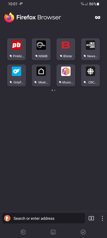
The update to Firefox 106 on Android changed the appearance of pinned shortcuts on the homescreen, so that now only a few characters of the text appear before being cut off by an ellipsis. For instance a shortcut labeled "Newschoolers" will appear as "News..."
This is a request to revert to the previous homepage appearance, or, better yet, provide an option to increase the size of the shortcut icon grid, so that the full text may be displayed.
Thank you for your consideration. 🙂
Solved! Go to Solution.
- Mark as New
- Bookmark
- Subscribe
- Mute
- Subscribe to RSS Feed
- Permalink
- Report Inappropriate Content
15-11-2022 05:05 PM - edited 15-11-2022 05:06 PM
Thanks for the report & comments! We added the backplating to the text as a part of the new Wallpapers that were released in Firefox 106. The goal of the design was to ensure text was always legible against the various colors that could wind up behind the shortcut icons.
In this case, it's clear that there were usability concerns that we missed while this was in Nightly and Beta.
We'll need to come up with a more robust design solution to simultaneously solve both the background-color legibility concerns as well as the truncation concerns, but for now, we've moved the text back outside the backplated icons and returned site names to their original width. You should be able to see these changes in v107. Hope this helps, and thanks again for the input!
- Mark as New
- Bookmark
- Subscribe
- Mute
- Subscribe to RSS Feed
- Permalink
- Report Inappropriate Content
22-10-2022 03:42 AM - edited 22-10-2022 04:02 AM
I don't want to be rude, and please understand that complaints come from people actively using and having high standards for your products and your work, but I am also flabbergasted by the UI changes you make. How is this:

...an improvement over this:

Uneven vertical alignment (of the icons within their containers) that looks horribly off and limiting the displayed shortcut name by at least half compared to before (sometimes only displaying 4 letters instead of a fair ammount of up to 12 before).
I am genuinely curious what the arguments for that change are or if you have any UI/UX quality gates in place when forcing such changes no one asked for (while ignoring years old UI-requests upvoted by dozens that would objectively improve UX). The only thing I can think of is that it was intended to make the new "big button" design suggest that the shortcuts are press-able and make them look more uniform, but it is immediately evident that this is not worth the trade-offs and also poorly executed without proper alignment. Such half-hearted changes shouldn't reach beta if you have somewhat high standards for your product.
Personally I would also prefer a rollback to the previous design, or you could maybe move the pin for pinned shortcuts up in one of the corners of each shortcut to free up space to display more letters of the shortcut names.
- Mark as New
- Bookmark
- Subscribe
- Mute
- Subscribe to RSS Feed
- Permalink
- Report Inappropriate Content
23-10-2022 11:28 PM
I'd also like to see this change reverted.
I don't see the point of adding backplating? If the goal was to make the text readable against different choices of backgrounds, then I think the text color could just follow the color of other section titles on the home page (black or white, depending on the chosen background). Now, the truncation limits the text to 4 characters in some cases.
Also from an aesthetical point of view, the previous square tiles were more pleasing to the eye AND in accordance with the square tiles on desktop.
So please, consider this a regression and revert the change. There's no shame in admitting a mistake.
- Mark as New
- Bookmark
- Subscribe
- Mute
- Subscribe to RSS Feed
- Permalink
- Report Inappropriate Content
15-11-2022 05:05 PM - edited 15-11-2022 05:06 PM
Thanks for the report & comments! We added the backplating to the text as a part of the new Wallpapers that were released in Firefox 106. The goal of the design was to ensure text was always legible against the various colors that could wind up behind the shortcut icons.
In this case, it's clear that there were usability concerns that we missed while this was in Nightly and Beta.
We'll need to come up with a more robust design solution to simultaneously solve both the background-color legibility concerns as well as the truncation concerns, but for now, we've moved the text back outside the backplated icons and returned site names to their original width. You should be able to see these changes in v107. Hope this helps, and thanks again for the input!
- Mark as New
- Bookmark
- Subscribe
- Mute
- Subscribe to RSS Feed
- Permalink
- Report Inappropriate Content
16-11-2022 01:50 PM
Thanks for listening and replying to the community. Much appreciated!
- Mark as New
- Bookmark
- Subscribe
- Mute
- Subscribe to RSS Feed
- Permalink
- Report Inappropriate Content
16-12-2022 06:55 PM
- Mark as New
- Bookmark
- Subscribe
- Mute
- Subscribe to RSS Feed
- Permalink
- Report Inappropriate Content
30-01-2023 06:35 PM
I have a new feedback,
improvement request on android firefox browser.
- Shortcut (URL) buttons. the alignment currently is fixed position. Request = allow user to re-shuffle them as wish.
Reason.
sometimes, user needs to "group together" the relevant URLs for quick access. Eg. "same category". "Frequent used put at TOP position".


- Starting with the current version 151.0.1, on the Firefox Home page, the shortcuts got shifted all the way to the bottom of the screen. The shortcuts used to be closer to the middle of the screen. in Discussions
- homepage in Discussions
- Recent update (mac) wiped out all my pinned shortcuts on the homepage in Discussions
- Frustrating UX issues on Firefox Android: Redirect loops, Tab management, and Shortcut clutter. in Discussions
- Why is the homepage in Firefox Android now less customizable? in Discussions
