- Mozilla Connect
- Ideas
- Theme and decluttering layout
- Subscribe to RSS Feed
- Mark as New
- Mark as Read
- Bookmark
- Subscribe
- Printer Friendly Page
- Report Inappropriate Content
- Subscribe to RSS Feed
- Mark as New
- Mark as Read
- Bookmark
- Subscribe
- Printer Friendly Page
- Report Inappropriate Content
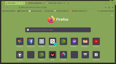
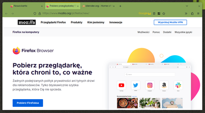
Hi, I've started to play with color.firefox.com long time ago but recently found out I can hide additional borders/tabs, and unify theme to monochromatic, and it looks perfect! (Figuratively).
I would like you to consider making something similar for minimalistic experience. I'm sure people would love it.
One issue was I couldn't change startup page text to dark, cause it follows background color.
Not necessary colors are important here, rather, hiding all borders, and "inputs". I think now it is almost self explanatory what is clickable... (almost every black text and button is interactive, and "plays some role") There is no more need to emphasize "input text" area.
Those are my small suggestion to the design and layout, hope You will find it interesting.
theme: https://color.firefox.com/?theme=.....
- New idea 8,532
- Trending idea 64
- Needs more 2
- In review 13
- Exploring more 12
- In development 57
- Not right now 8
- Delivered 207
- Closed 36


