- Mozilla Connect
- Discussions
- Firefox mobile needs more context menu entries, De...
- Subscribe to RSS Feed
- Mark Topic as New
- Mark Topic as Read
- Float this Topic for Current User
- Bookmark
- Subscribe
- Mute
- Printer Friendly Page
Firefox mobile needs more context menu entries, Desktop needs less
- Mark as New
- Bookmark
- Subscribe
- Mute
- Subscribe to RSS Feed
- Permalink
- Report Inappropriate Content
07-03-2023 09:12 AM
Its very weird. Both are pretty much the same browser, while mobile seeming totally underpowered, Desktop a bit too much.
Mobile
Links
- No "save link as bookmark"
- No Addon context menu entries (Ublock, Noscript, more)
Tabs
- Nothing with containers of course
- No Addon entries (Singlefile)
Desktop
way too many context menu entries, the entire reason this project exists.
It seems Firefox tries to please everyones workflow by allowing to do the same action in 2-4 different places. This is weird and clutters the UI extremely. Also Developer tools are integrated, that should be opt-in, as Firefox should be a user browser.
Links
- Inspect
- new Window actions (not everyone uses multiple windows)
- Private window (makes no sense as the threat is websites not local attacks 90% of the time)
- Pocket (okay this will probably stay...)
- Inspect
Tabs
- Reopen closed tab: the Addon is way better at using this functionality, more intuitive
- close tab? You got the "x" for that
- Close multiple tabs? Really nieche
- Bookmark tab? You got the star for that
Images
- Email Image
- Inspect
Blank page
- Select all?
- inspect
- view source? not for everyone
- another way to create a bookmark, all buttons again implemented, why?
unified searchbar
- options are common keyboard bindings and should be opt-out, apart from things like "Paste and go" or "Redo" that are untypical
----------------------------------------------
I am sure I forgot something, especially more context options for mobile, for images and more.
Mobile is underpowered but actually has a good approach, it just is not customizable enough but forces this minimalism and one-way-to-do on everyone.
Desktop is cluttered, has no GUI (or even officially documentation) way of changing context entries and seems like a total mess.
Less is often more. If you remove all that bloat you can actually add some buttons, like the home button, the "temporary container button" or the "redo closed tab" button (Addons).
What do you think?
- Mark as New
- Bookmark
- Subscribe
- Mute
- Subscribe to RSS Feed
- Permalink
- Report Inappropriate Content
07-03-2023 12:34 PM
- Mark as New
- Bookmark
- Subscribe
- Mute
- Subscribe to RSS Feed
- Permalink
- Report Inappropriate Content
11-03-2023 04:12 PM
I'm not gonna vote for this suggestion because it includes too many disparate suggestions, some of which I disagree with, some of which I agree with.
- Mark as New
- Bookmark
- Subscribe
- Mute
- Subscribe to RSS Feed
- Permalink
- Report Inappropriate Content
13-06-2023 05:54 AM
what do you agree with and want dont?
- Mark as New
- Bookmark
- Subscribe
- Mute
- Subscribe to RSS Feed
- Permalink
- Report Inappropriate Content
20-10-2023 01:50 PM
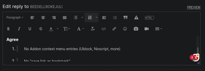
@xUxSxExR, I disagree with Firefox Deskop requiring less entries, but agree that Fenix needs more.
Disagree
It seems Firefox tries to please everyones workflow by allowing to do the same action in 2-4 different places. This is weird and clutters the UI extremely.
Agree
No Addon context menu entries (Ublock, Noscript, more)
No "save link as bookmark"
Inspect [Element Support]
- Mark as New
- Bookmark
- Subscribe
- Mute
- Subscribe to RSS Feed
- Permalink
- Report Inappropriate Content
20-10-2023 01:51 PM - edited 20-10-2023 01:55 PM
Apologies about that post being barely intelligible... This hideous site has butchered the formatting. If it were Markdown I would have provided a comprehensive list with my rationale for each, but I don't particularly want to use this site any more than need be.
- The web pages in the new sidebar cannot be opened with the middle mouse button in Discussions
- Past roadmap: to understand the future, look at the past in Discussions
- New in Firefox (Desktop Only): Visual Search in Discussions
- Try Link Previews in Firefox 142 - See What’s Behind a Link Before You Click in Discussions
- Thunderbird Android approval for Google’s Advanced Protection Program in Discussions

